Gestalt Principles of Design — Symmetry
We tend to perceive symmetrical elements as being connected, even if they are not.
The Gestalt Principles of Design are a set of concepts and guidelines drawn from gestalt psychology, which theorizes that the mind tends to process organized groups of things as a whole, rather than a number of individual things. These concepts can help to integrate a better understanding of perception into the way we arrange information, so that we can communicate more effectively.
This is the fifth entry in a multi-part series on the gestalt principles of design. The first, Proximity, deals with how the mind perceives groups of things differently based upon how closely they are arranged. The second, Closure, explains how the mind is capable of perceiving more information than what is actually visible. The third, Similarity, explains why the mind perceives objects that look similar as a group or pattern. The fourth, Continuity, suggests that elements that are arranged on a line or curve are perceived as more related than elements that are not.
How Symmetry Works
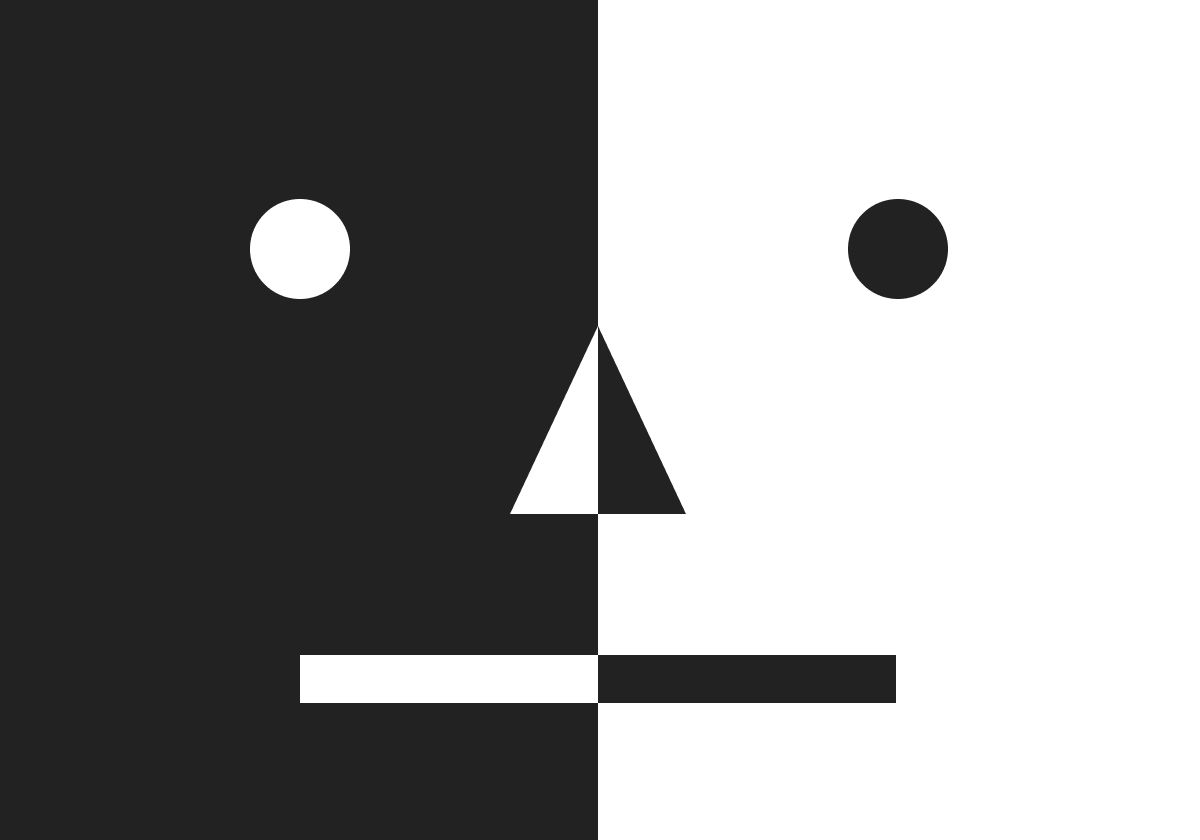
Symmetry — the balance of shapes, sizes, and position of elements along common axes — is probably the most powerful of the gestalt principles when it comes to creating stability. When symmetry is present in a layout, a viewer can more easily and quickly perceive not only its contents but also its sub-structure. A layout’s sub-structure consists of its taxonomies of information and the meaning and purpose of connections between its elements, both functional and conceptual.
Put simply, balance is a lubricant for understanding.
There are several different kinds of symmetry. A few examples include:
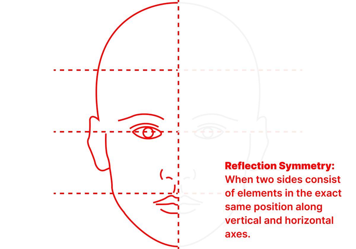
- Reflection Symmetry — This is the most common type of symmetry; the one we probably think of most often. When two sides consist of elements in the exact same position along vertical and horizontal axes, we see one as a reflection of the other. Facial symmetry, for example, tends to increase the subjective sense of beauty in a person.
- Rotational Symmetry — When elements retain their position and orientation while rotated around a central point or common axis, they have rotational symmetry.
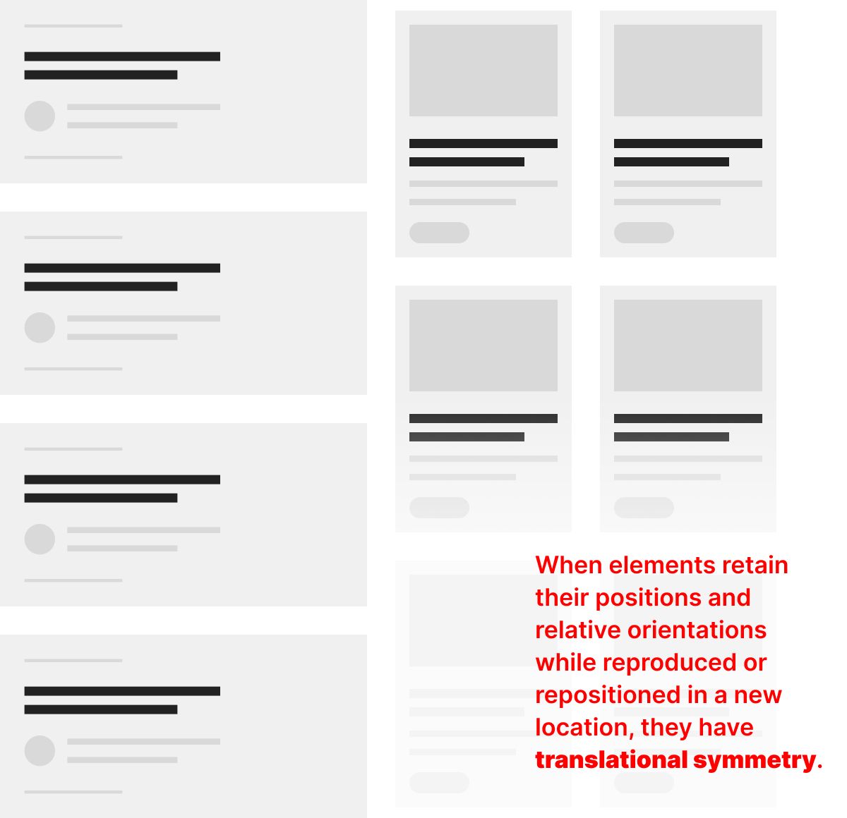
- Translational Symmetry - When elements retain their positions and relative orientations while reproduced or repositioned in a new location, they have translational symmetry. I’ll use this one in a specific design example below.
Translational symmetry is an essential aspect of atomic design. Brad Frost’s idea of design organisms — “groups of molecules joined together to form a relatively complex, distinct section of an interface” — is a perfect example of how translational symmetry works, and why it makes for good design.
Think of Frost’s “organisms” as components that are used throughout a design system. A common example is a content card used on pages or templates that consume and list content from other places, like a list of articles or a grid of products. When the layout of the cards remains consistent, it helps a viewer quickly understand that all the “organisms” are of the same kind, regardless of how the layout displays them.
How Asymmetry Works
Symmetry communicates stability because the elements we see are balanced. Asymmetry, though, doesn’t necessarily turn imbalance into instability. Asymmetry can be used to communicate motion, action, and directionality, while retaining an overall intentionality.
Several years ago, I wrote an article describing the benefits of a three-column layout for content hubs. Asymmetry is critical to the function of this kind of layout; the elements in the left column do not mirror those in the right, but they are aligned with conventional scan patterns and harness psychological expectations to facilitate the uses and actions for which they are intended.</>
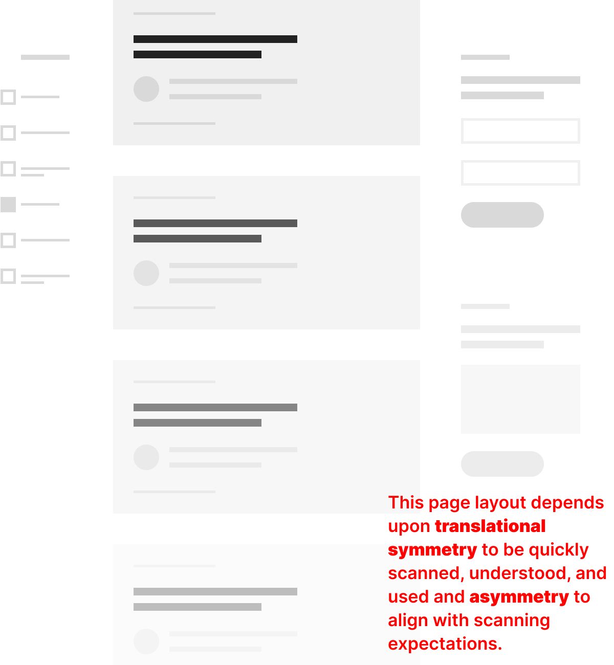
On the left of this layout are tools to filter the center column’s list of content, while on the right are engagement points intended to deepen the content experience elsewhere. Translational symmetry is at work here, of course, as the elements of the filter, the content list, and the engagement points are all standardized and repeated. But it is the overall asymmetry of the layout which is intentionally making use of established L-pattern expectations. To explain this, I’ll quote from my old article:
“Usability studies continue to affirm the truth that visitors follow an “L” pattern when scanning a page. (This is also sometimes called an F-pattern.) Basically, this means that we scan a page from top to bottom, and then from left to right. In addition to describing the directional pattern of user behavior, the “L” pattern also speaks to expectations. When scanning, we expect to see certain kinds of information in particular places. Years of online advertising and layout conventions employed on the rest of the web — all the other websites that we look at in our lives — have resulted in commonly held expectations that apply in all contexts. Business and pleasure.
Those commonly held expectations fall into three types, which, thanks to the L-pattern, naturally fall into three locations on a page:
Tools: Visitors expect to see tools they can use to alter their experience on the left. Most websites tend to provide navigation menus, filters, and localized search tools in this area of the page because that makes it easier for users to see how their choices affect the content displayed on the page as they use them.
Content: The center of the page is typically reserved for the main contents of a page because that makes it easier for a user to quickly scan down the page in one direction, rather than having to move their eyes up and down and back and forth. I recommend a single-column, because that makes it easier to scan. Grids, for example, tend to result in less-informed navigation decisions because they require much more thinking to interpret. A user must figure out the logic of how the contents of the grid are arranged over two axes before making a selection. Often, they don’t do this well and end up retracing their steps once they’ve realized the page they’ve landed on isn’t actually what they were looking for.
Related Information: Information that is related to the page’s main content, such as similar articles, promotions, advertisements, and calls-to-action, are typically placed on the right so that they can be contextually positioned to the main content.”
Understanding how the expectations of a viewer are already established by the experiences they have elsewhere is an important point in design, generally. This is why design conventions exist. We all must balance doing something a new way with doing it an established way, especially when the desired outcome depends upon someone else’s attention.
If our design choices require that a viewer “re-learn” how a layout’s components work each time they are seen, or how an overall layout works as it extends across axes, then we are expecting a viewer’s focus too early. Attention supports focus; it’s not the other way around.
Like all the gestalt principles of design, symmetry can be a deceptively simple concept. I hope these examples help you think through the layouts you create throughout the entire design process in ways that result in a more scannable arrangement of information.
Christopher Butler, July 7, 2023
Filed under: Essays