Gestalt Principles of Design — Closure
The mind is capable of perceiving more information than what is actually visible.
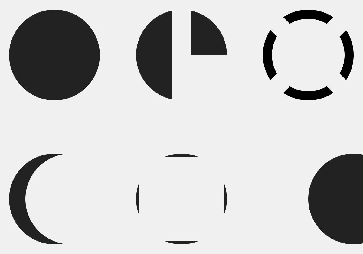
The Gestalt Principles of Design are a set of concepts and guidelines drawn from gestalt psychology, which theorizes that the mind tends to process organized groups of things as a whole, rather than a number of individual things. These concepts can help to integrate a better understanding of perception into the way we arrange information, so that we can communicate more effectively.
This is the second entry in a multi-part series on the gestalt principles of design. The first, Proximity, dealt with how the mind perceives groups of things differently based upon how closely they are arranged.
Classic Examples of Closure
The simplest illustration of closure is to describe a shape by partially outlining it.
When we look at a four-sided dashed line, we see a square, not a series of rectangular shapes.
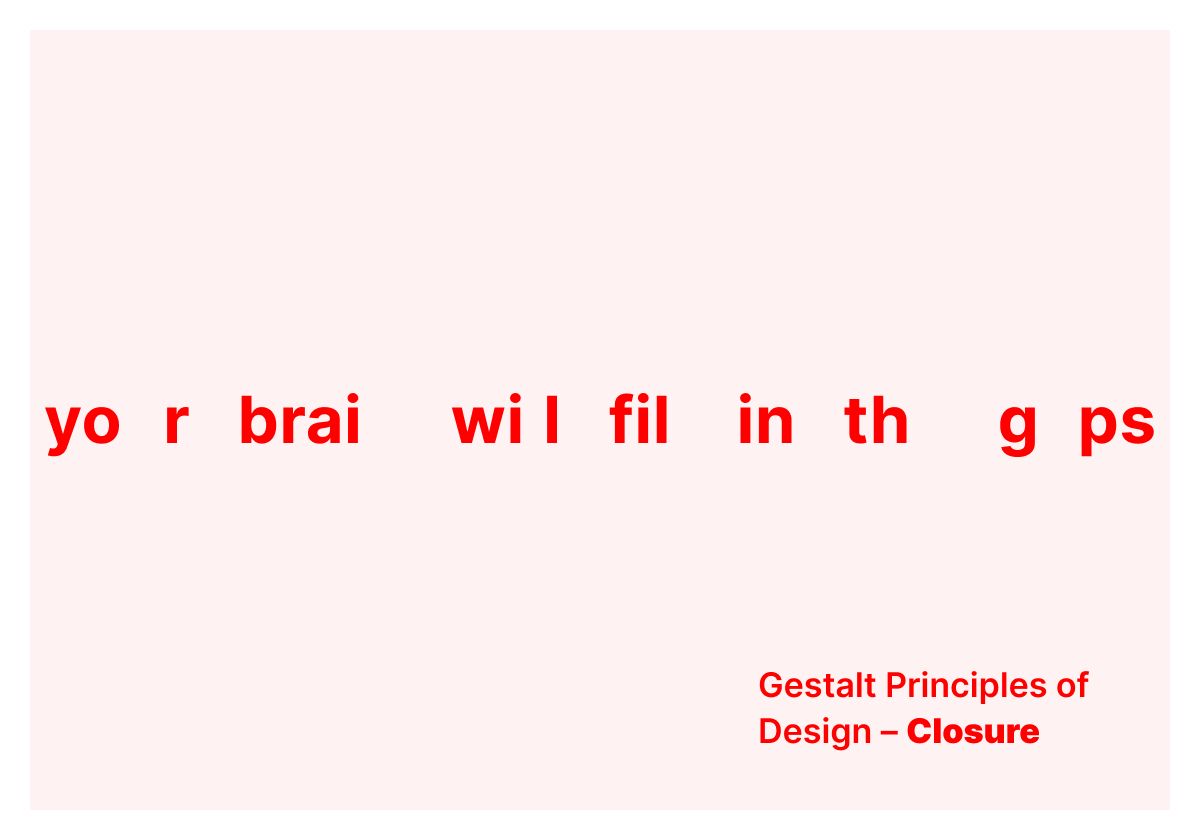
The principle of closure is so predictably strong, that it even allows you to make sense of words when letters are completely left out.
Icons often depend upon the principle of closure to communicate the most meaning with the least amount of visual information.
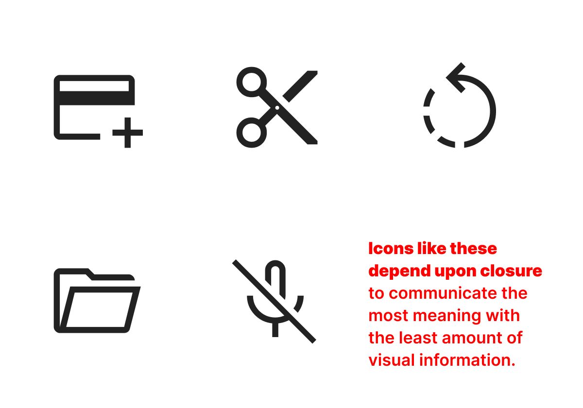
The smaller an icon is, the more each individual pixel counts toward the message the overall image is meant to communicate. As a result, an icon often becomes more readable when visual information is taken away.
Applying the Gestalt Principle of Closure to UX
A common pattern I make use of — and frequently advise of others — is to interrupt a scannable vertical axis with information arranged across a horizontal axis.
This technique works especially well when the perpendicularly arranged information is related but not essential to the prevailing narrative a page or screen contains. I wrote about this in a previous essay about adapting long-page designs for better scanning.
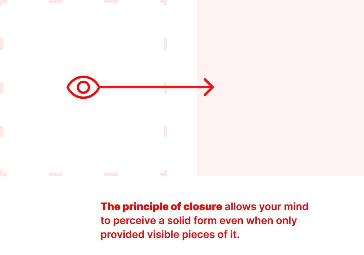
A simple example of this idea is to insert a horizontally scrolling group of images within a vertically arranged column of text. When you do this, the principle of closure plays a role in how the availability of more information is signaled to a person scanning the page. When an image runs off the screen — when its width pushes beyond the available viewport — that is a visual language signal to those scanning the page that there is more to see. The eye sees only part of a shape that has been repeated, but the mind understands that more is beyond the visible edge.
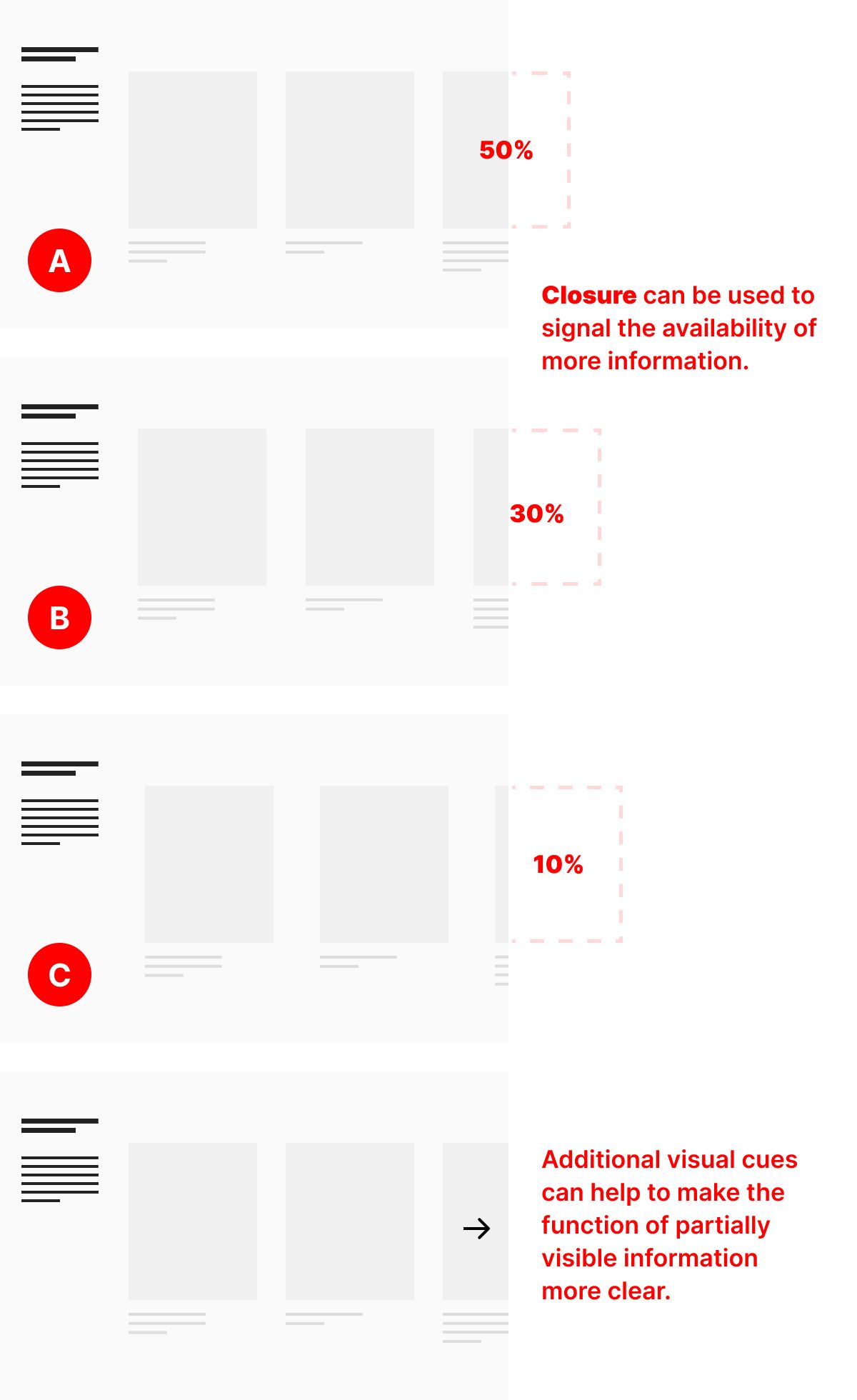
Sometimes, this technique will communicate enough on its own. Other times, depending upon how much of the partial image is available, an additional visual language cue — like an arrow — is needed to signal to a person scanning the page that there is an action — like scrolling to the right — available to them. In the three examples above, (A), (B), and (C), the decreasing amount of available information from the last image in the horizontal series begins to make it less clear at a scanning level what is happening in that space.
The addition of an arrow icon makes the structure all the more explicit.
Like all the gestalt principles of design, closure can be a deceptively simple concept. I hope these examples help you think through the layouts you create throughout the entire design process in ways that result in a more scannable arrangement of information.
Christopher Butler, June 16, 2023
Filed under: Essays