Gestalt Principles of Design — Proximity
When objects are placed near one another, the mind perceives them as a group.
If the term is new to you, the German word gestalt literally means the way a thing has been placed or put together.
Like many German words, there is no exact translation in English, so you may see the words form, shape, pattern, or configuration used as a substitute. But these words don’t quite get to the full meaning of gestalt. To better understand the meaning, it’s useful to understand the idea of gestalt psychology which teaches that brains tend to process organized groups of things as a whole, rather than a number of individual things. Many concepts come from this: a “school” as a group of fish, students, courses, or ideas; a “machine” as a group of interoperating mechanisms; a “layout” as a collection of visualized information.
The Gestalt Principles of Design are a set of concepts that apply the gestalt understanding of perception to how information can be treated and organized to better communicate.
Proximity — When objects are placed near one another, the mind perceives them as a group.
Like all the gestalt principles, this seems obvious. But what’s useful about studying these principles is they can be a tool for both how you approach your design as well as one that helps you critique what you’ve created.
The creative process must always maintain a balance of order and disorder. So it’s natural that, though you may begin with an intent to maintain a particular kind of system, arrangement, or order to what you make, aesthetic elements and choices may begin to break that system down as the process unfolds. Verifying the integrity of the gestalt principles is a useful way to ensure the function of something you otherwise are satisfied with visually.
Proximity is a simple notion, but it’s one of the more impactful in interaction design because of how often visual elements on a page or screen also have a function available to users. Words and images are often interactive, representing parts of a system — ways to do things, ways to navigate, ways to communicate. So it’s critical that, when initially scanned, these elements are grouped in ways that make their arrangement appear intentional and allude to their function.
Here are some examples:
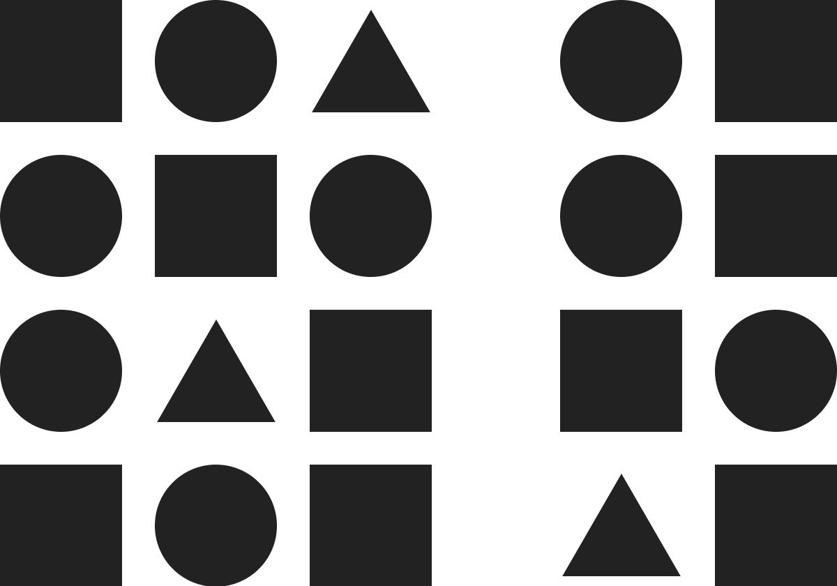
Ex. 1 — Grids of Objects
This is a very simple way to illustrate the principle of proximity.
On the left, there is one group of shapes. The brain “sees” this as a single group, though the shapes may, for example, be different sizes or images of different things. Because they have been put together, it is implied that they have something in common.
On the right, there are two groups of shapes. Because space between the two groups is greater than the space between the individual shapes in each group, the brain will “see” these as two groups rather than one.
Ex. 2 — Lists of Text
Another way to illustrate the principle of proximity uses text rather than shapes.
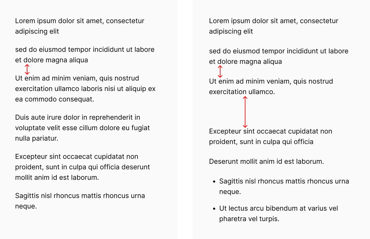
On the left, the items in the list are spaced and aligned equally. This implies that they are all of equal importance and comprise a single group.
On the right, there are two lists. Because the space between the lists is greater than the space between the individual lines of text in each group, the brain will “see” these as two collections of text, rather than just one. Additionally, the list that has used indentation is using that to indicate that some items are further grouped together in support of another.
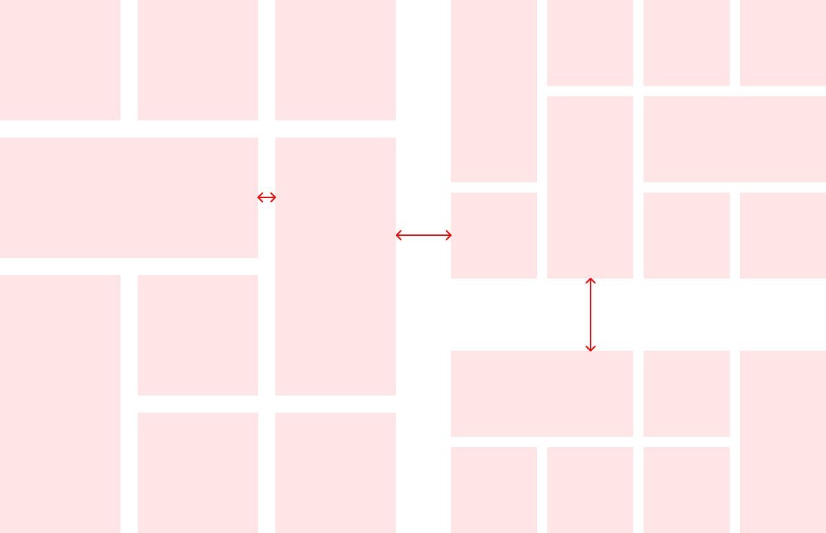
Ex. 3 — Shape and Space Dependencies
Because the brain is “looking for” space and arrangement to help describe an order to information, it will interpret individual elements of a visual language together, not separately.
A simple way to illustrate this is to compare two ways of handling the kinds of widgets we commonly see in the sidebar of a webpage.
On the left, these two widgets are shown as enclosed elements, where the edges of a shape describe their form. The space between the two indicate that they are two different things, but the proximity between them groups them separately from other elements on the page.
On the right, these two widgets are shown as unenclosed elements. Without the edges that would be provided by a surrounding shape, these widgets need more space around them to enable them to be scanned as separate features and still understood as functionally similar.
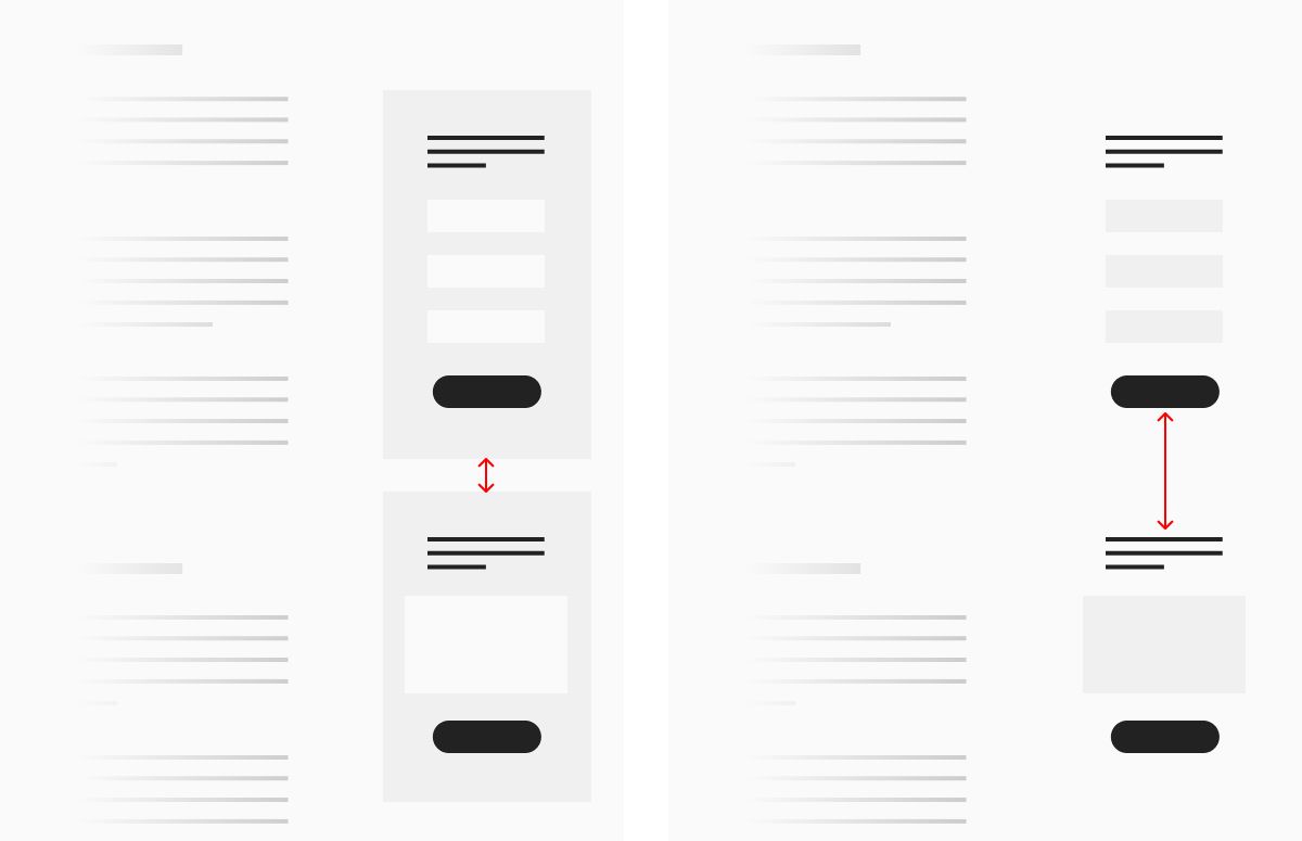
Ex. 4 — Full Bleed Elements
A common convention in website design is to make heavy use of “full bleed” rows of information — rows that extend fully across the available horizontal space of a viewport. This is often because designers take a “mobile first” approach to their design, organizing and styling information for smaller viewports and applying those choices to all conditions. I generally don’t support this manner of working, unless of course it’s truly meant as mobile first in terms of sequence, followed by work to adapt and specify layout for larger screens. This is because “full bleed” (or edge-to-edge) elements tend to present obstacles to clear scanning as they occupy more space in a person’s visual field.
I’ve often compared scanning a visual layout to scanning a text document. When we scan, we’re looking at how the information is arranged in order to draw conclusions about what it is, how relevant it is to us, and what actions we can take. Proximity is a primary visual cue that describes information architecture to the brain. When all information is clustered and stacked, the brain will tend to “see” it all as equal or the same, when it often is not.
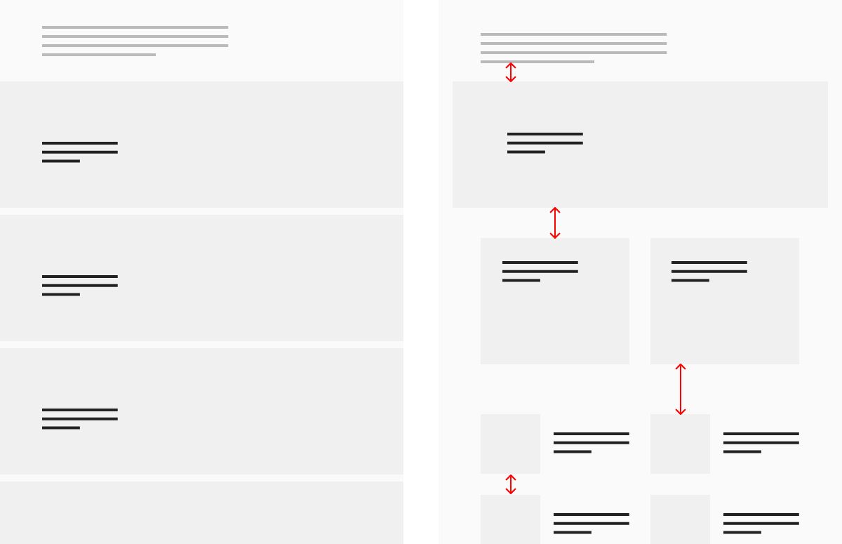
On the left is a layout where the majority of the page’s elements are in enclosed, edge-to-edge rows. The more rows there are, the more the brain has to transition back and forth between scanning and reading in order to properly differentiate between the information they contain.
On the right, the layout has been adapted to cluster information in a variety of ways, leaning on the visual distinctions and the space between them to help the brain quickly perceive structure.
Ex. 5 — Typography
Scanning a page’s text to determine what it’s about, and again, whether it’s relevant to you and what you can do in response, is one of the most important functions that proximity can assist.
I’ve already written an article about this, called Negative Space Typography, which is about how the space between typographical styles can be differentiated and systematized in order to make scanning more efficient and productive.
These are simple concepts, but sometimes deceptively so. I hope these examples help you think through the layouts you create throughout the entire design process in ways that result in a more scannable arrangement of information.
Christopher Butler, June 14, 2023
Filed under: Essays