Negative-Space Typography
Controlling the space between text styles is as important as differentiating the styles themselves.

Whenever I review design documentation, there are a few things I look for in the first few seconds. All of them have to do with how scannable a page or screen’s layout is.
In fact, I was re-reading Design School Layout, by Richard Poulin, the other day and was reminded how good his definition of layout is:
“Layout is the method by why a graphic designer arranged, places, and composes visual elements which ultimately affects the understanding of, and reaction to, the information.” — Richard Poulin
Why is this a good definition? Because it differentiates between understanding and action. The way Poulin words this makes clear that, of course, understanding something and reacting to it are two different experiences. But he also orders those terms, implying that one leads to the other — understanding first, action second. That’s the way it should be, though it often is not so. And that’s where good design comes in. The entire purpose of paying attention to the subtleties of layout is to ensure that viewers can quickly and efficiently scan information, understand it, and react accordingly.
And so, one of those things that first catches my eye in a layout is actually among the subtlest of details. Although, once you see it, you can’t unsee it. It’s negative space typography.
Let me show you what I mean.
Below is an example of two simple page layouts.
Layout (A) maintains equal spacing among all its lines of text — this is an extremely common convention. I see it in nearly every piece of design documentation I review, and I see it all over the “live” space — the web, apps, etc.
Layout (B) assigns variable spacing between lines of text, proportional to the type size and in keeping with the content-based relationships between them.
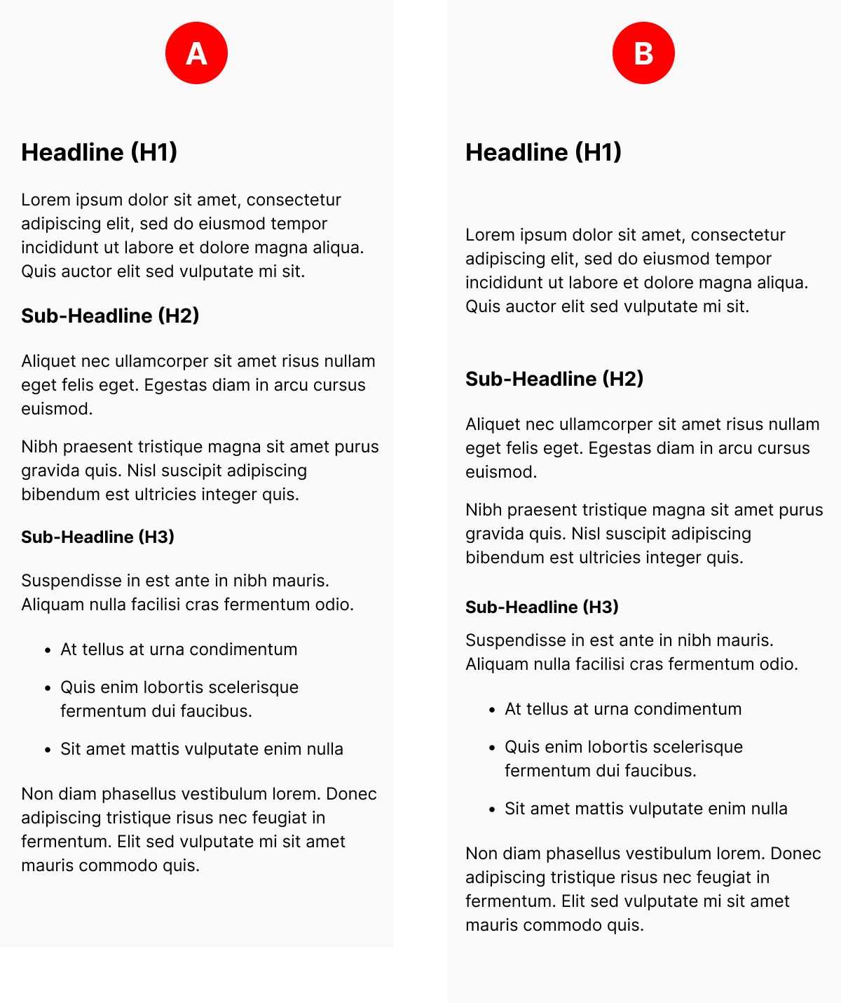
Which is better? (B) is better, every time.
Why? Because by varying the space between the lines of text, you make it easier for a scanner to perceive the structure of the page — specifically, what things go with one another and what things support other things. Perceiving structure at the abstract level helps scanners understand the depth and weight of content prior to making a decision to focus more attention on it.
Take a look at the image below. In this comparison, I have indicated the lines of text (and their different weights/densities) with grey boxes.
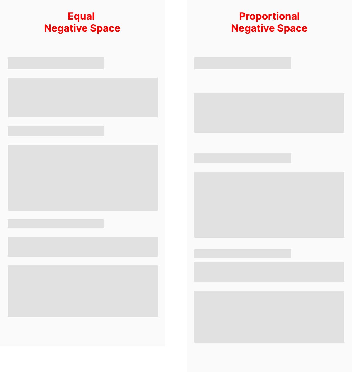
Here, you more clearly see here how the spaces between these boxes imply structure in two different ways.
In Layout (A), the structure implies that each object relates to one another in the same way, comprising a single group.
In Layout (b), the structure is more complex. The spacing implies that the objects relate to one another in different ways, some clustering together and others standing alone. This follows the structure of most text more closely.
In a text with multiple paragraphs, lists, and a variety of headlines and sub-headlines, the sizes of text and the spacing between them — the negative space — will be the first thing that communicates structure, before the meaning of the text itself.
I always advise designers to go back and differentiate the negative space in their type systems with the same care they have applied to differentiating the positive-space components.
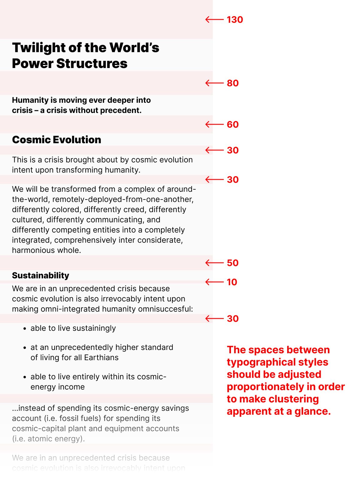
There are many tools available to designers to construct and document design decisions and layout. Some of them help you specify and systematize negative space typography, but most of them don’t. At this point in time, I don’t think there’s any substitute for taking the time to manually assign, construct, and document this kind of spacing. The image above is meant to communicate this as an idea, though, not to recommend a particular value for the space according to a particular type size. As you scan the image and look at the numbers marking the space between lines of text, think of the proportional differences, not the specific values.
It has been my experience that adjusting this one aspect of a layout’s typography can have a major impact on how effectively it is scanned, understood, and acted upon.
Christopher Butler, June 9, 2023
Filed under: Essays