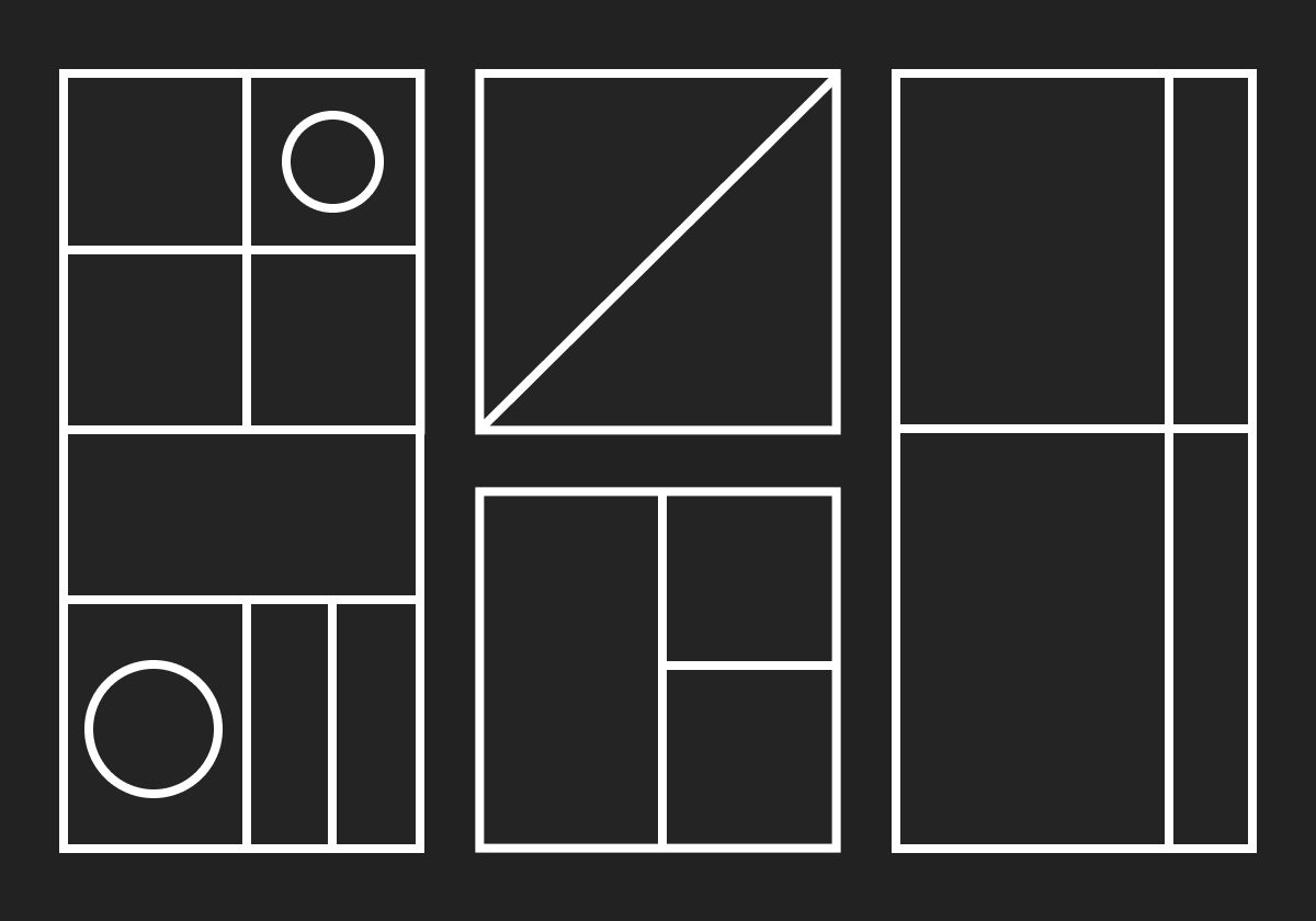
How to Adapt Long-Page Designs for Better Scanning
The longer your page, the harder it is to scan. Finding ways to consolidate content and shorten the page length will help focus your visitor’s attention and action.
I’ve spent the last decade advising design teams on how to get better results from their designs. What that ultimately amounts to is helping designers use information architecture and visual language to communicate more efficiently to scanning prospects.
My mantra is this: a good piece of information design should communicate the most truth even when given the least amount of attention.
No matter what kind of information you’re working with, what kind of person you’re trying to communicate to, or what kind of result you’re hoping for, there is just one factor that will determine the outcome: attention. And if there’s one thing that most designers have in common, it’s that they assume that what they create will get much more of it than is realistic. The attention of everyone in the world is in equal demand. They have less to give than you want.
Now, you can’t make your thing more important to anyone, but you can make its importance more clear to them and help them sustain their attention longer.
In this article, I’m going to share five steps you can take to redesign something that I’m assuming is longer, more information dense, and harder to scan than it should be.
I’m going to use a single example as my starting point: a long case study written and designed by one of my clients. I’ve converted this page — which remains, to this very day, live on the web — into a wireframe to protect their reputation. :)
Step 1: Consolidate and Group Content
The first reason a page is probably too long is because it’s been designed to look interesting. The problem with that is we assume that the best way to attract and intrigue someone is by heightening and sustaining novelty — or, in other words, showing them a lot of information in a lot of different ways. We design our pages like all-you-can-eat buffets of information, hoping that something will pique someone’s interest. But guess what? The whole internet is the buffet. Your page is a single cocktail olive.
There’s an instinct in this approach to design that isn’t wrong, though. And that is to design your page to be looked at first. That is what will happen. The visual language of a page is what will first communicate to a person looking at it. When they ask what this information is, whether it’s relevant to them, and what they should do next, they will answer each question by way of visual information alone, in fewer than a few seconds. The problem for most pages on the web are that they are closed before the looker gets accurate answers to those questions. The best way to get someone to bail on your page is to overwhelm them with so much information that they are simply not able to move from looking to scanning to reading.
So the first thing you can do is edit.
Let’s look at my example: (A) is the original client page, (b) is my redesign. This is a very long case study — way too long. In fact, if you use a 1,040 pixel vertical space as your “screen” measurement, it takes scrolling through 15 screens to make your way through the entire thing. Very few people will ever do that and get much value from the time.
The first thing I did was to read through the case study and consolidate and group content. Generally, this example used far too many images, arranged in far too many ways. It was designed as if a featured story in a magazine had been reconstructed vertically. That’s actually the way most creatives tend to approach design — get away with as many “print” conventions on the screen as you can. While I’m all for not being held back by digital conventions, I am not all for ignoring how a scanner assesses information.
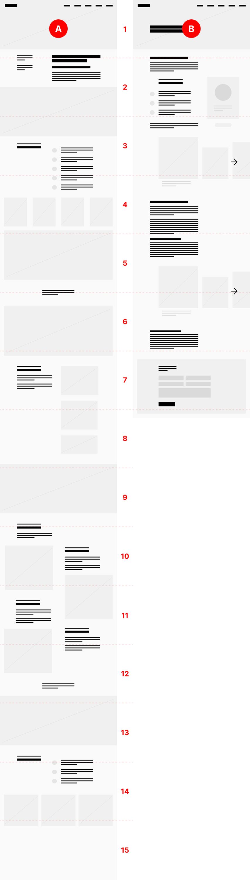
Notice first that I consolidated text and image. The first thing I wanted to do was make it easier to scroll and scan the entire page. By gathering the text into three main sections and the imagery into two main sections, I’ve cut the length of this page in half.
Yes, people will scroll. But they won’t scroll forever. And scrolling itself isn’t the real issue. What’s at stake is whether the rhythm of your screen will keep them focused on your page’s content when they do.
Result: Consolidating the material makes it easy to group information, which makes it easier for a scanner to understand what individual pieces are and how they relate to one another.
Step 2: Summarize
I mentioned before that a visitor to a page will ask and answer three questions within seconds of arrival. They are:
- What is this information?
- Is it relevant to me?
- What should I do next?
Answering these questions is critical to a visitor moving from scanning to reading. If they don’t know what the page’s information is or whether it’s relevant to them, the only action they will take is to leave.
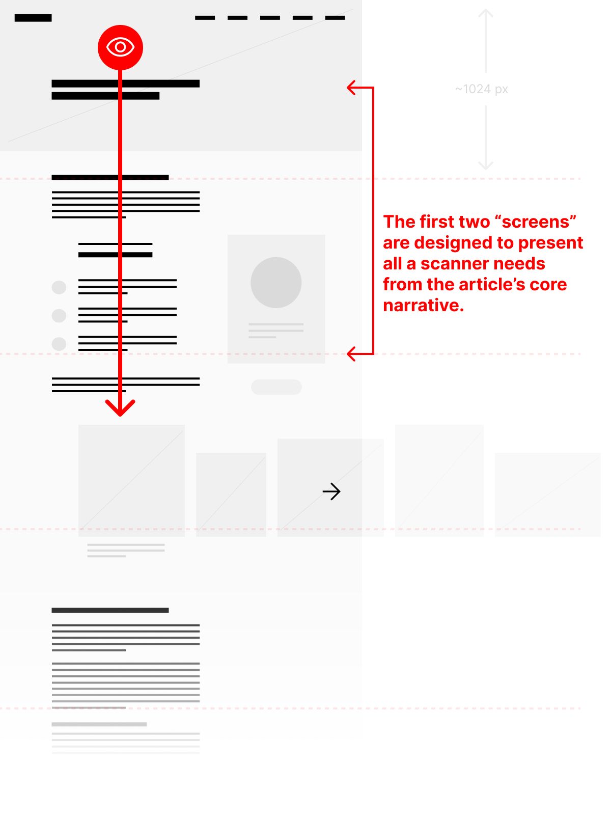
In this redesign, the second thing I did was to rearrange the narrative so that the first group of text provided an overall summary of the page’s entire narrative. Since this is a case study, the summary contains the background of the project, the challenge, the solution, and the results. All of this is summarized in easily scannable text before a single set of images is put in front of the visitor.
I’ve written elsewhere that what a prospect needs from a case study are three forms of proof:
- Proof of Results
- Proof of Fit
- Proof of Quality
They need them in that order. So summarizing this page gives a visitor a sense of what was done, how its effectiveness was measured, and the social proof of a testimonial from the client. If all of that information is satisfactory, then the need for quality — how well was the thing made, how well did it express the brand, how good does it look, etc. — can be satisfied.
Even if this was not a case study — if it was a long-form article, perhaps, or a long product or service landing page — the need for a summary would be the same.
Result: Providing an abridged version of the page’s narrative at the top enables a scanner to choose to spend more time and attention on the rest of the page.
Step 3: Anchor Your Design to the Y-Axis
I am committed to the idea that anchoring the most important information on your page to the Y-axis will support better communication and action. Follow the link in the previous sentence to read a much longer piece on that idea alone.
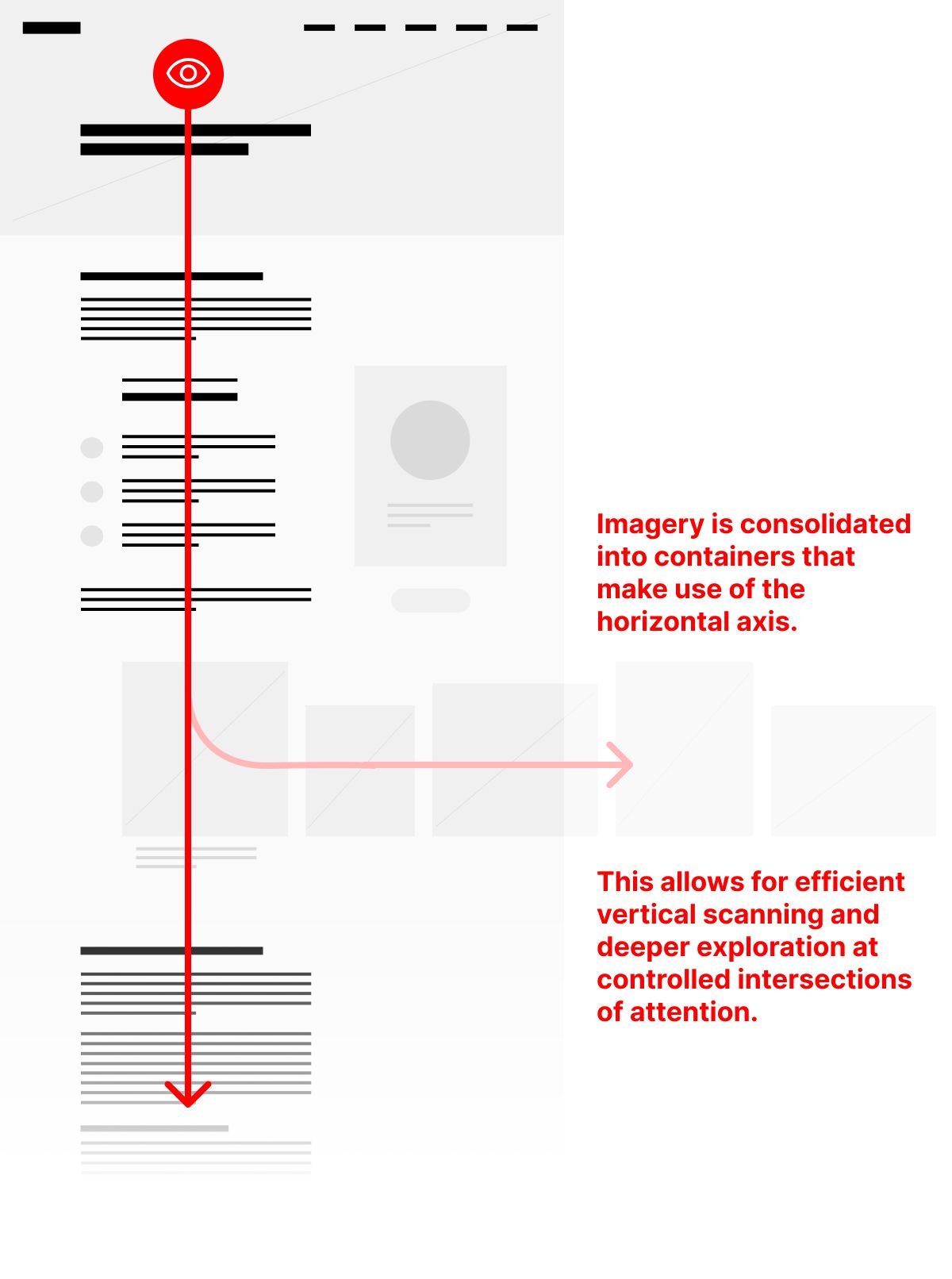
But by grouping the kinds of information on this page and standardizing layout choices for those pieces of information — both text and image — it establishes a solid “backbone” to the page that a visitor can quickly scan without distraction.
When you ask your visitor to look in only one place, especially as you anticipate the page to be in motion as it is scrolled, it helps them to focus.
Result: aligning key information to a single axis makes it unmissable and easier to process in a shorter amount of time.
Step 4: Attention Intersections
Notice how the images in the layout above, now that they’re consolidated into two groups, create two horizontal axes across the page. By running perpendicular to the Y-axis, doesn’t designing them this way go against what I just advised? No. What these create are attention intersections
As a visitor scans the page vertically, it’s as if they are driving down a highway that runs from the top to the bottom of your page. As they approach these image areas, they appear as attractions along side the main road, but don’t obstruct the driver’s view ahead. They can look past these side streets and continue on their way, or they can choose to turn off and explore them more.
I have found that gathering information that supports the main narrative of the page — but isn’t necessary to be experienced in full — and using perpendicular axes in the layout to display it is the best way to shepherd a visitor’s attention.
Result: Designing around attention intersections enables visitors to quickly identify the priority of information on the page with visual language alone. They can then better choose to spend more time on what could be considered a secondary layer of depth to the page’s information architecture.
Step 5: Accommodate Swift Action
Finally, one of the most perplexing things I find time and again when evaluating client designs is that so much attention has been paid to the design of a novel layout that seeks to make a strong first impression that the whole point has been forgotten. I’ll ask, “but what do you want a visitor to do next?” I always encourage designers to identify a single, primary action on every page they design. This is the one thing they want a visitor to do next. If that primary action isn’t obvious from an initial scan of the page — again, by harnessing the visual language to communicate priority — then there is work to be done.
A case study, especially, requires a primary action. Why take the time to describe what you can do, what you have done, and what the result of your work was if you don’t give someone who is interested in getting you to do that for them something to do with that desire?
The first piece of new information that I added to this redesigned page was a form at the bottom. I tend to call forms like these “opportunity forms” — they’re how someone becomes an opportunity for you. That’s my primary action on this page. But, because it’s all the way at the bottom, it’s not exactly using visual language to communicate it’s priority — at least not early enough.
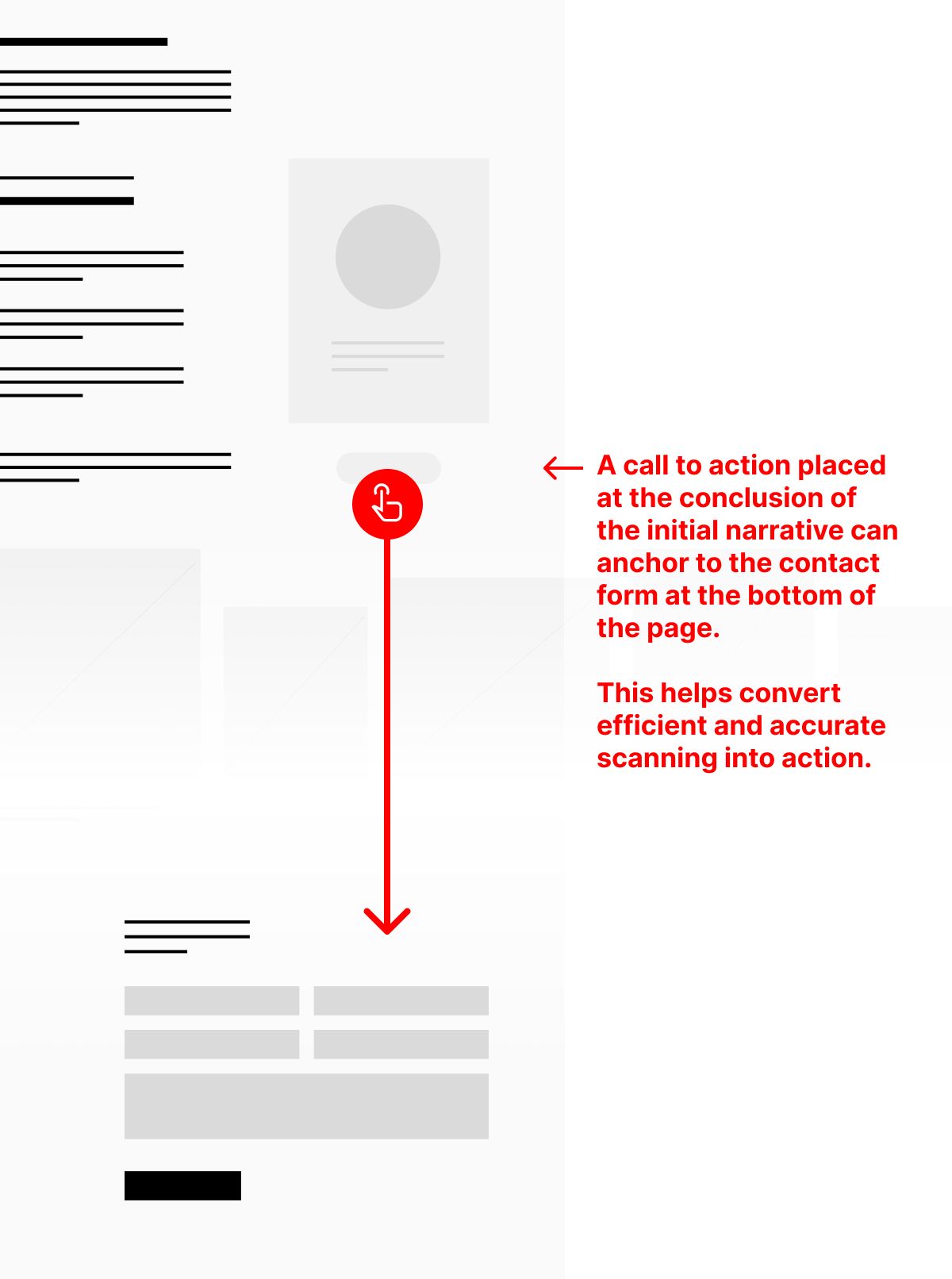
So, I added a small button beneath the testimonial toward the top of the page. Now, a visitor who only scans the introductory summary can see a possible action right away. I’m also thinking quite literally about how the social proof of a testimonial greases the wheels of action; I’m hoping that a visitor who reads the words of someone like them will be more likely to want to get in touch. Clicking the single button there could either anchor them to the form at the bottom of the page or open a modal window that reproduces the form there.
Result: The primary action is immediately identifiable, accessible early on the page, and accelerates action.
Length is Not the Problem
It’s not that a shorter page is always better. Nor is it true that a long page is always worse. The issue at heart here is how well the page communicates.
It has been my experience that the longer a page is, the more variety its information architecture tends to have, which accelerates the inevitable deterioration of attention over time. Fixing this problem is partially addressed by shortening the page; the rest has to do with combating the deterioration itself. We do this by structuring information to be as efficiently scanned as possible, and then providing additional layers to supply information to those who choose to go deeper.
Christopher Butler, June 3, 2023
Filed under: Essays