Gestalt Principles of Design — Similarity
When objects look similar to one another, the mind perceives them as a group or pattern.
The Gestalt Principles of Design are a set of concepts and guidelines drawn from gestalt psychology, which theorizes that the mind tends to process organized groups of things as a whole, rather than a number of individual things. These concepts can help to integrate a better understanding of perception into the way we arrange information, so that we can communicate more effectively.
This is the third entry in a multi-part series on the gestalt principles of design. The first, Proximity, deals with how the mind perceives groups of things differently based upon how closely they are arranged. The second, Closure, explains how the mind is capable of perceiving more information than what is actually visible.
How Similarity Works
The most basic example of similarity in a web design context is text.
Every element of the visual language used on a web page is — should be — a reference to the information architecture of the page itself, and of the website as a whole. I’ve written on this idea before, using a text outline as an example of how the mind looks for simple cues — like indentation and outdentation — to help understand the way information is prioritized on a page. The most basic rules of typography are, essentially, an information architectural system. Otherwise, all text would look the same, and, according to the gestalt rule of similarity, be perceived as equal — as peers in a flat system. But that is not how text works.
Text requires structure — both conceptually and visually. Visual structure communicates conceptual structure even before a single word is read.
This is why typographical systems are so important to scanning; a headline’s size, weight, and spacing differentiates it from the paragraphs that follow it, a list’s indentation and segmentation set it apart from surrounding text, and a pull quote stands outside of the overall structure to intentionally signal the importance of a single line extracted from the whole. The differences in how text is treated — the breaking of similarity — function as visual language, separately and apart from the meaning of the actual words themselves.
Similarity and Objects
It’s been said that all web design can be reduced to boxes and arrows. That’s not an unfair simplification, as long as we recognize that boxes come in many shapes and sizes!
A common pattern in interaction design contexts is the grid. I don’t mean underlying grid, but the practice of arranging visible objects in a grid.
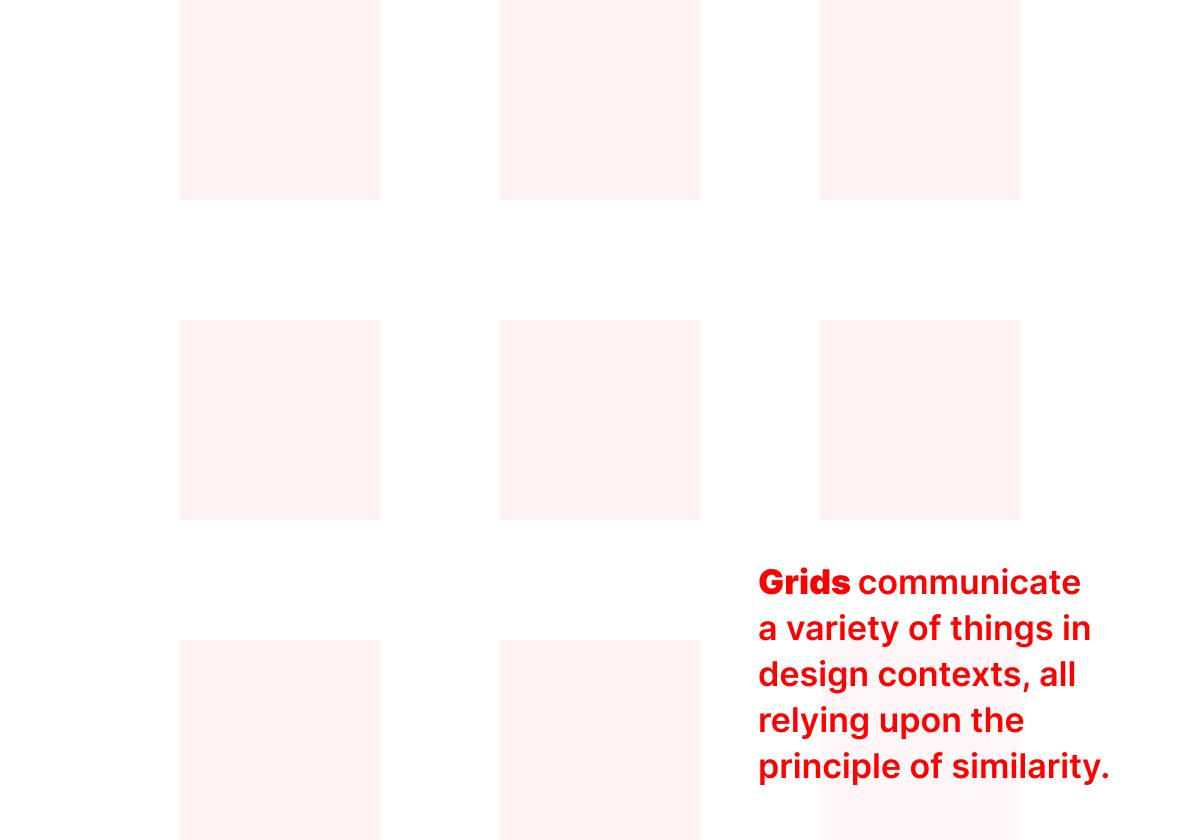
In a preliminary design, like a wireframe, the above arrangement would communicate several things:
- there will be more than one object here
- the objects are variations of the same type of content
- the objects are of equal importance
This is a simple example of similarity that we are accustomed to seeing and using frequently. The basic details communicated by a grid of identical boxes is so common that the danger in using it is that it doesn’t communicate the information that implementation of the design require without additional visual details: Are these objects clickable? If so, where do they go? Are they database objects, or manually created elements unique to the page? Etc.
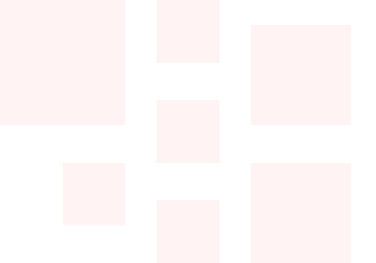
In this example at least one other conclusion could be added to the list above: these objects are not all of equal importance. However, the grid alone won’t communicate whether all the objects are the same kind of content. This is the principle of similarity at work, for better or for worse.
Similarity and Actions
A well-designed web page will anticipate that a scanning visitor will be asking and answering three questions within seconds of viewing it:
- What is this information?
- Is it relevant to me?
- What should I do next?
The way text is handled on a page will go a long way toward assisting with these questions. But answering the third question will depend more heavily upon purely visual cues. As there is rarely just one “door” through which a website user can pass on a given page, arrangements of multiple objects that each represent possible paths will determine how clearly a visitor perceives their options.
Like grids, lists are the most basic approach to presenting a finite number of options. A good list will use the principle of similarity to communicate its function visually before any text is read.
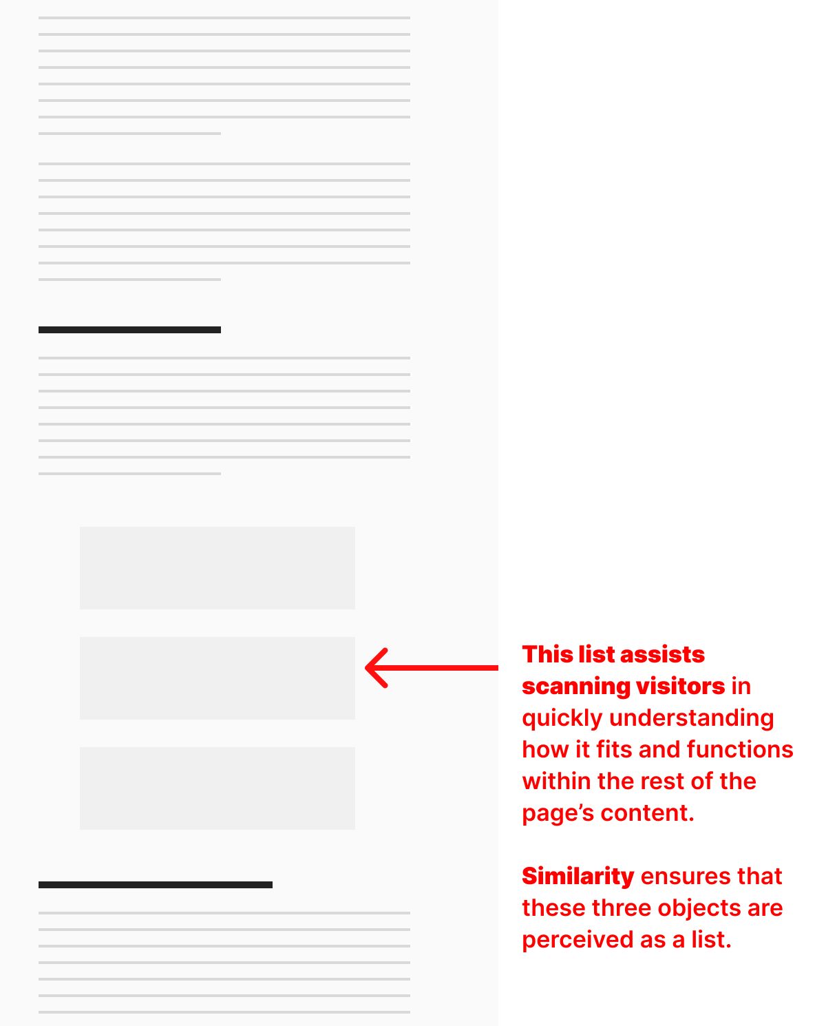
In a preliminary design, like a wireframe, the above arrangement would communicate several things:
- there will be more than one object or option here
- the objects are variations of the same type of content
- the objects are of equal importance
Like a grid, further details could be included to signal the same kinds of unseen information that are critical to their function: Are these objects clickable? If so, where do they go? Are they database objects, or manually created elements unique to the page? Etc.
But more importantly, this list uses similarity to identify itself as a group of the same kind of objects that is different in form and function from the material surrounding it.
Like all the gestalt principles of design, similarity can be a deceptively simple concept. I hope these examples help you think through the layouts you create throughout the entire design process in ways that result in a more scannable arrangement of information.
Christopher Butler, June 25, 2023
Filed under: Essays