Gestalt Principles of Design — Continuity
Elements that are arranged on a line or curve are perceived as more related than elements that are not.
The Gestalt Principles of Design are a set of concepts and guidelines drawn from gestalt psychology, which theorizes that the mind tends to process organized groups of things as a whole, rather than a number of individual things. These concepts can help to integrate a better understanding of perception into the way we arrange information, so that we can communicate more effectively.
This is the fourth entry in a multi-part series on the gestalt principles of design. The first, Proximity, deals with how the mind perceives groups of things differently based upon how closely they are arranged. The second, Closure, explains how the mind is capable of perceiving more information than what is actually visible. The third, Similarity, explains why the mind perceives objects that look similar as a group or pattern.
How Continuity Works
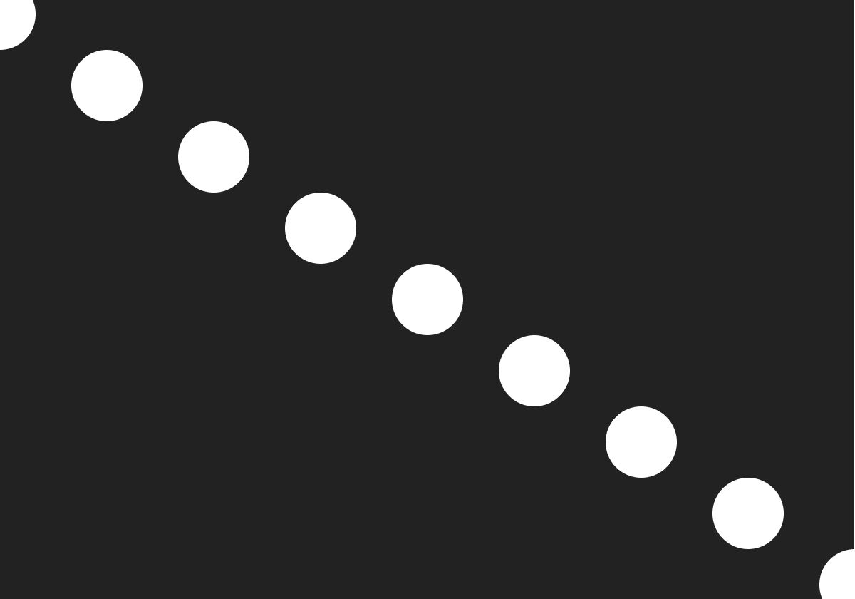
The simplest example of continuity is one you can see anytime you look up into the night sky. Every constellation is an image we’ve imagined based upon the arrangement of stars. Their position relative to one another enables our mind to imagine a line between them — some more easily than others.
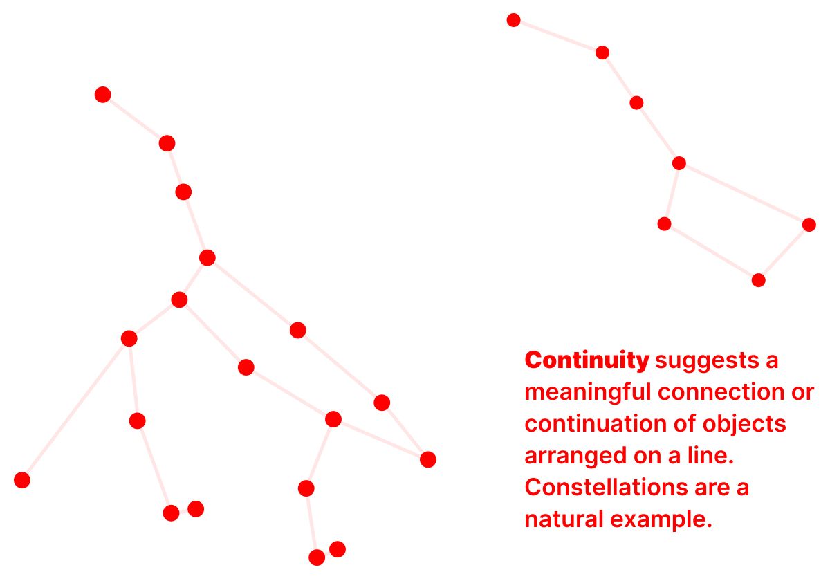
When we imagine a line connecting them, we’re not only imagining a piece of visual information. We’re inferring a meaningful connection between objects because of their similarity and their proximity. Continuity is something of a combination principle.
Continuity in Layout
There are many aspects of layout that reflect the principle of continuity.
Any element that repeats — either vertically or horizontally — depends upon continuity to suggest to a viewer how to read or interact with it. Simple examples of this could be a horizontal navigation menu, a vertically arranged list in a sub-menu, a horizontally arranged slider of images, etc.
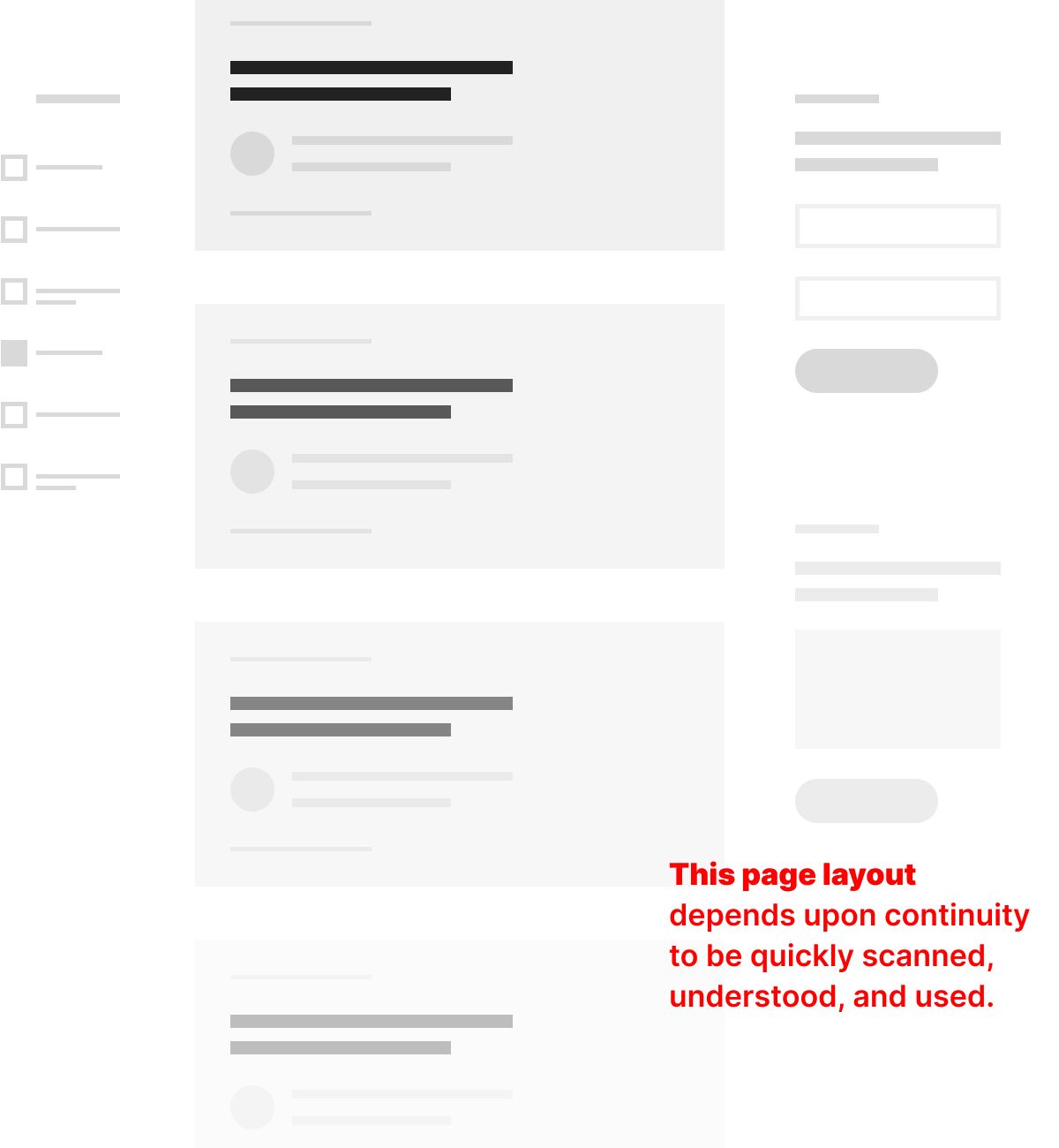
In the example above, the layout of a page that aggregates a large number of articles depends upon continuity to be quickly scanned, understood, and used.
On the left, a vertical arrangement of filtration options makes use of a repeating checkbox pattern to be easily interpreted based upon visual cues alone. In the center column, a vertical arrangement of article cards uses a standard combination of informational elements that can also be rapidly scanned because of its repetition. On the right, a series of related engagement points functions similarly.
All three columns depend upon continuity to support their individual functions and the overall efficacy of the page.
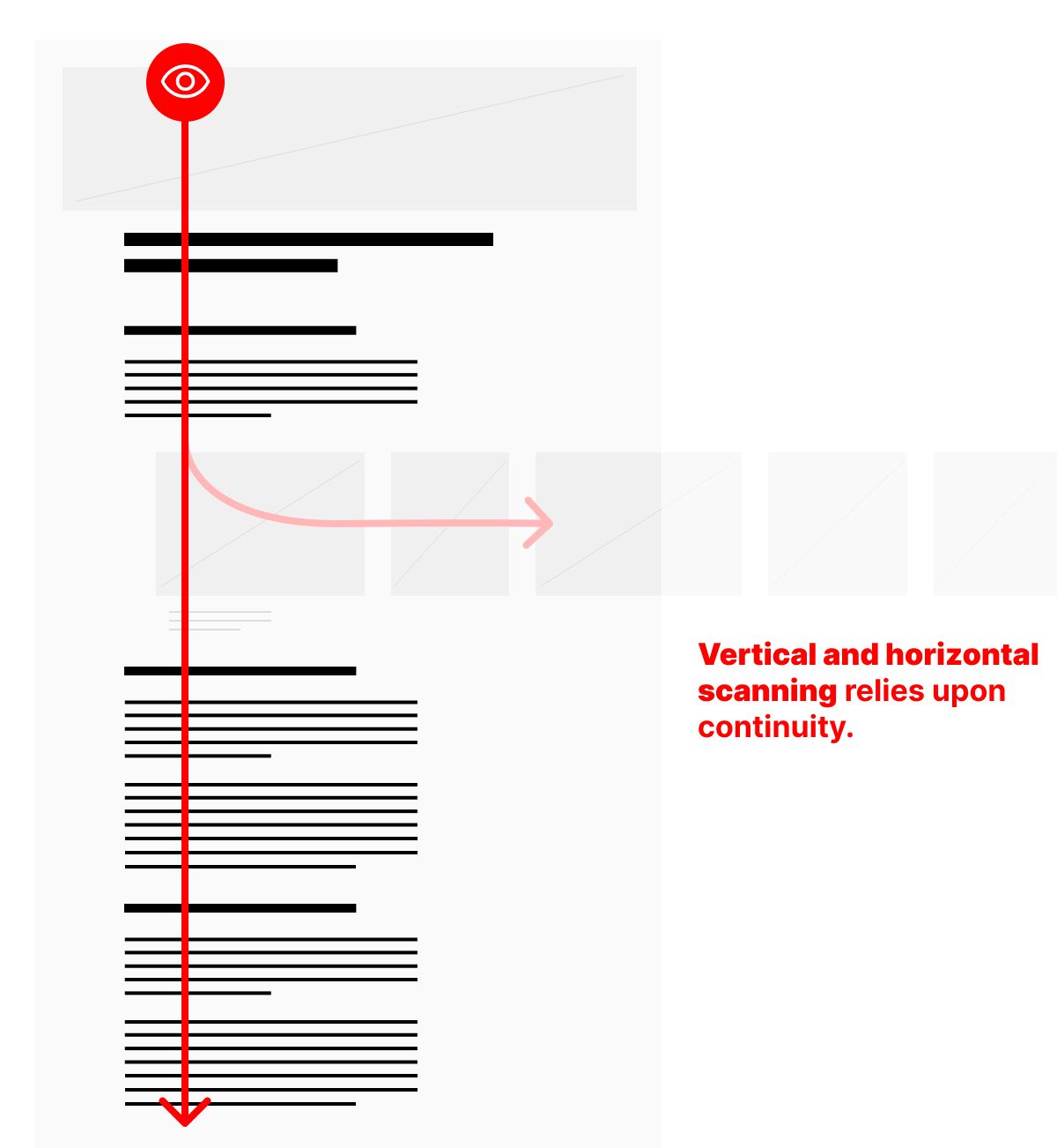
A more subtle example of this, like the one above, can be experienced when either good typography or the intentional arrangement of similar elements enables scanning of a page along a single axis.
I’ve written about this in a previous post about using the y-axis to maintain focus and attention.
Like all the gestalt principles of design, continuity can be a deceptively simple concept. I hope these examples help you think through the layouts you create throughout the entire design process in ways that result in a more scannable arrangement of information.
Christopher Butler, June 30, 2023
Filed under: Essays