What Eyes Want
The connection between the eye and the mind is essential for designers to understand.
If you drive up or down Interstate 95 between Virginia and Georgia, you will see sign after pun-riddled sign beckoning you to pull off the highway and enjoy the strangely diverse amenities of South of the Border. These signs are impossible to miss.
Today, over 175 South of the Border signs remain along the interstate; when I was a child making a two-day road trip from Boston to Florida, there were more than 250. Spotting them, reading them, and counting them made for an entertaining diversion for me, a bored kid in the back seat. “Keep yelling kids, they’ll stop!”; “Time for a PAWS?”; “You never sausage a place!”; all advertising a glorified truck stop that seems to have everything from the expected — gas and food — to the unexpected — a sombrero tower, arcade, and convention center — to the unnecessary — a reptile lagoon.
Though my eight-year-old mind boggled at the feat of creating so many signs, it never occurred to me until I saw them again as an adult in the driver’s seat that they are a perfect exhibit of the eye-mind connection.
The Eye-Mind Connection
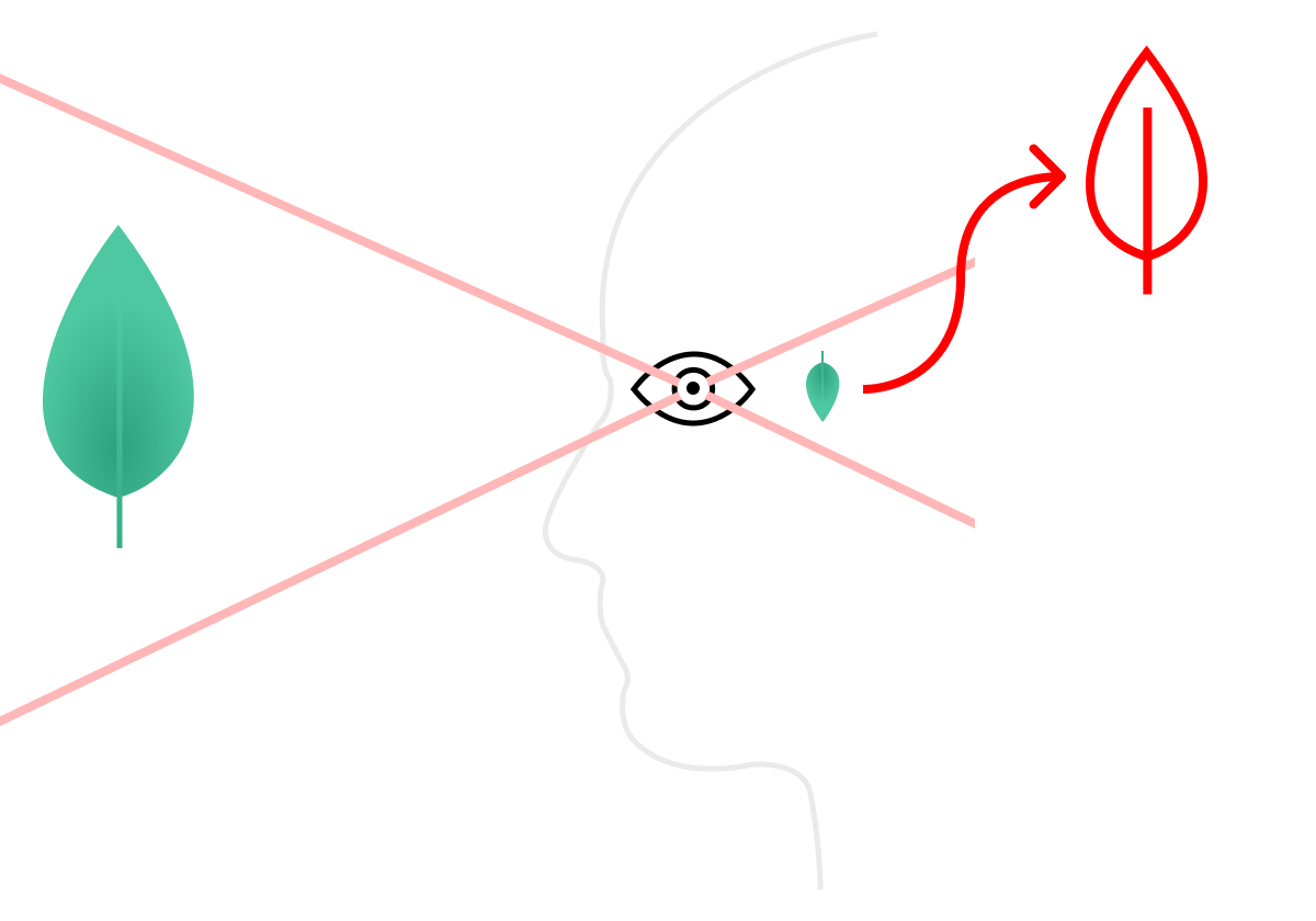
The connection between the eye and the mind is, especially for designers, obscured by common phrases we often use in describing the choices we’ve made, our intent for them, and our analysis of how they work: This arrangement of text and image “draws the eye”; this alignment maintains “line of sight”; this heat-map “tracks the eye” and shows where “users look.” But none of these expressions accurately describes what is really happening, because none of them use the word “mind.” Looking is a physically enabled act, but it is a qualitatively mental one. In fact, many specialists argue that “vision is 90% mental and 10% physical.”
As surprising as that may seem, it does reflect a true understanding of human physiology. Eyes, after all, don’t do any thinking. They are as smart as the lens of your camera. In fact, they are basically the same; when open, they take in light. Light creates electrical impulses that travel the optic nerve to the visual cortex in the occipital lobes at the back of your brain. That’s where the “seeing,” insofar as we mean understanding happens. In other words, the eyes see without the brain, but without the brain, we see nothing.
Our entire body works like that. The majority of physical function is autonomous, which is astounding when you stop to ponder it. You don’t have to consciously tell your eyes to blink, your lungs to breath, your throat to swallow, your legs to hold you up, or your fingertips to feel. Virtually every cell of your body works — can do what it needs to do — without your brain’s involvement. But our experience of every single one of the functions those cells perform does rely upon the brain. Being conscious — being aware — of what your body is doing, then, is relatively rare. When we drive, for example, we focus more on getting somewhere than on the specific interaction of our body and machine; slowing down is a conscious action, while the movement of foot from accelerator to brake becomes more and more unconscious the longer you drive. We put the operation in the background so that we are able to see and perceive the things around us — even hundreds of signs. Often our mind-body detachment is even more profound. It’s not uncommon for commuters to be so lost in thought that they hardly experience the drive itself. The same applies to most of our mundane movements through the world. Even now, as I type this, I focus more on expressing thoughts and hardly at all on the individual movements of my fingers on keys. The gap between function and perception is wide.
As it turns out, much of design is about capitalizing on that gap. In the design of objects, understanding the careful balance of mind-body coordination is what makes for useful ones. A good object is not one that you want to be rid of, nor one that functions best when you are distracted. And yet, in the world of visual media, distraction has been a powerful tool. Take any five-minutes you experience on the web, for example, and consider how often your “eye” is drawn away from one thing and to another. This is by design. The entire system of digital advertising is build upon the premise that where the eyes go, the fingers will follow. And from a theoretical perspective, that adage is built upon the incredibly fragile coordination of eye and mind. It is far easier to break it than to maintain it.
Eye/Mind coordination is when your eyes, your attention, and your mind are all focused on the same thing at the same time. And, as any athlete, craftsperson, or meditation practitioner knows, it is hard to maintain! There’s a reason meditation is often done with eyes closed.
Is The World Designed for Eyes?
The eyes are no more important a sense-making tool of the body than the ears, nose, tongue, or skin. Our apprehension of reality is so much more than just seen. And yet, the seen has a much greater share of human culture than the heard, smelled, tasted or felt. That may seem hyperbolic to say, but it has actually been studied! There is quantitatively more research done on vision than any other sense, and while it has been suggested that this is so because current technology lends itself better to vision study than, say, taste study, a better reason is because civilization is built to prioritize the seen. Ask anyone who cannot see and they will tell you this is so.
Consider for just a moment how easy it is to walk down the street with earbuds in your ears, or while drinking a cup of take-out coffee, or while fully clothed and even with gloves on your hands. But now imagine the same experience — the same pre-occupation of your many senses — but with your eyes shut. How many steps do you think you’d get before falling or colliding with something or someone? The world is built by the hands, but for the eyes. And yet, the eye will wander.
A reasonable question to ask is whether, when our eyes wander, it is the eye leading the mind or the other way around, and whether we’re seeing and understanding or just seeing.
Research on this has been done, as well. In a study titled, “Where the Eyes Wander: The Relationship Between Mind Wandering and Fixation Allocation to Visually Salient and Semantically Informative Static Scene Content,” a group of scientists attempted to observe how the mind orders and prioritizes visible information and how conscious we are of that. In the study, participants were asked to observe images of urban scenes and were prompted randomly and asked whether they were focused and attentive or whether their minds were “wandering.” Scientists noticed that participants generally retained more detailed observations when also reporting their own mind wandering than when reporting focus. In other words, it appears that “the visual system is still able to discriminate visually salient and semantically informative scene content during mind wandering and may fixate on such information more frequently than during attentive viewing.”
Another similar study, titled “Gaze-based Signatures of Mind Wandering During Real-World Scene Processing,” resulted in a similar conclusion: “gaze indices typically considered to represent greater engagement with scene processing (e.g., longer fixations) can also indicate mind-wandering.”
Set aside all the academic jargon — these studies are very difficult to read! — and the point is rather stark: our vision and perception are far sharper than is our own awareness of them. We see and understand even when we think we are not. This has major implications for design.
Still, it sounds impossible, doesn’t it? But it is at the root of virtually every user-study I have run or observed. And, it underlies the age-old, intuitive design principles of arranging information to be scanned first and read second.
User Studies and Eye-Mind Perception
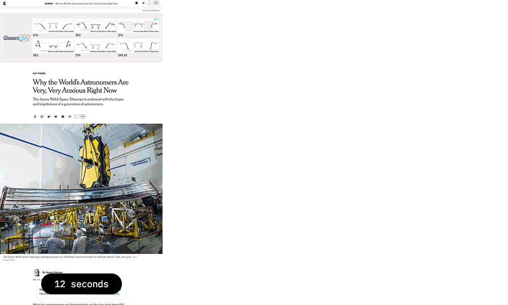
Recently, I ran a quick and informal study of a client’s website in order to prove a hunch I had that their visual language was communicating the wrong things and alienating visitors. My client sells technology and expertise to wineries, and wanted to establish a connection between the value of heritage and craft held by the wine makers and the stability and stewardship their design and technology can provide. They made heavy use of old-style typefaces and historical imagery in order to make their prospects feel “at home.” But my worry was that in so heavily applying this aesthetic, the entire purpose of their business would be missed or misunderstood. As it turns out, the data showed this to be so. Despite paid media efforts driving lots of new visitors to the site, few were sticking around and even fewer were taking action. I ran a quick impression test to see what was going on — to see why they weren’t seeing what they should be seeing.
The test was a classic transient attention test. I gave the participants just 8 seconds to view the homepage. They were instructed to scroll through it but not click on anything. After 8 seconds, the page was closed and they were asked to recall any visual details that stood out to them and to summarize the purpose of the page. Despite the presence of text clearly expressing the business’s purpose of providing “commerce technology” for “wine brands,” every participant recalled the imagery, which depicted an ancient Greco-Roman tapestry, and volunteered words like, “history,” and “archaeology,” when asked to summarize the purpose of the page. Not a single person ever mentioned wine or technology. My point, of course, was made: the visual language was wrong. But the insight is right in line with these studies: when our minds wander, they don’t stop thinking, and those thoughts form into judgements regardless of how conscious we are of that happening. For designers, understanding this is critical. We work against that reality with every image we create.
Just eight seconds is not as few as may seem. In 2015, Microsoft conducted a study and concluded that the average attention span had dropped from 12 seconds in 2000 to 8. In parallel with that drop, ten-second tests used to be common in the web design world to elicit conclusions about scalability and clarity, and as time has progressed, the test’s interval has shrunk.
It is arguable that even just 8 seconds is far longer than necessary to scan a page, perceive its contents, and make a conclusion about their nature and relevance. These days, I assume all of that can happen in just a second or two.
Understanding Attention Span and Design
The goal of any page, of course, is to retain attention through its two major phases. First, transient attention, which is to say, “the short-term response to a stimulus that distracts attention” and then, second, selective sustained attention, which is conscious focus. A fascinating presumption in differentiating between these two forms of attention is that transient attention — our initial attention on anything — is inherently a form of distraction.
In other words, when we first give anything our attention, it is a distraction from what we were focused on before. This is true even when we are looking for that thing. And that is where judgement comes in. We scan that thing and our mind asks, “is this the thing I’m looking for?” and often answers “yes” or “no” before we are even conscious of it. When Indiana Jones, for example, rapidly scans a room full of cups to find the true Grail, his eyes hardly rest on a single one for more than a tiny fraction of a second. And yet, his brain is calculating, cup, cup, cup, grail? no, no, no faster than he even perceives. It’s all transient attention until his eyes rest upon that humble “cup of a carpenter,” and his attention becomes sustained.
The Grail scene is a useful illustration of how we navigate the world. And it’s a useful guide for anyone making anything that they hope will receive sustained attention. Just because your thing is the “true grail” of its kind doesn’t mean that your audience will “choose wisely.” Most won’t, and won’t even be capable of doing so.
The Nielsen Norman Group has written widely on cognitive perception and usability, and one particular phenomena they have focused on is the Aesthetic-Usability Effect. Put simply, it is the positive affect that visual appeal has on sustained attention and successful use — that “users are more tolerant of minor usability issues when they find an interface visually appealing.” Tolerance, here, isn’t just about attitude. It’s also about use. To be observably and measurably tolerant is really to respond to and/or use something more readily and successfully when it is visually appealing.
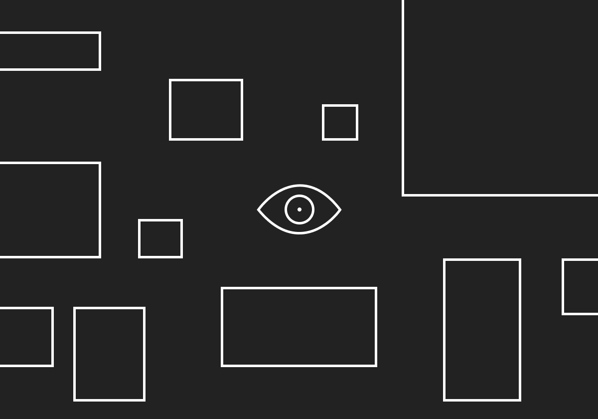
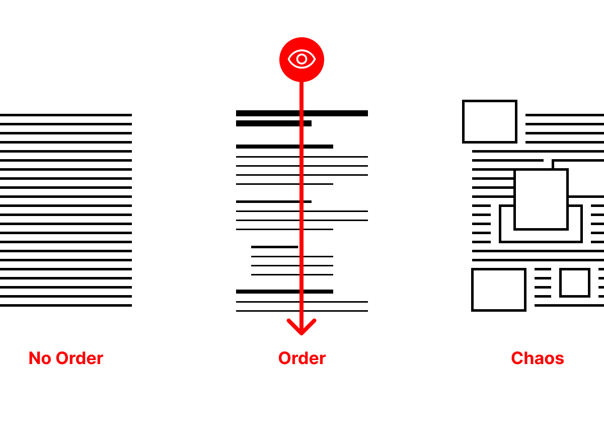
Simplicity, order, and symmetry are all elements that are typically seen as more aesthetically pleasing than their opposites — complexity, disorder, and asymmetry. These are by no means objective, but common nonetheless. And considering them in light of how we understand the eye-mind connection is critical. Because we don’t typically have conscious control over how our eyes scan and the judgements our minds make, information has to overcome bodies rigged to maintain transient attention rather than sustaining focus. Seriously, we have a deeply hard time controlling our eyes and minds! Religious people have a whole thing about “bouncing your eyes in order to avoid sin because they believe that seeing and feeling are inherently difficult to control. As mocked as that perspective is, it’s not without some grounding in reality. We do scan the world, take in information, make judgements about it, and even take action as a result without consciously thinking about it. So the order of our information — how we structure it, format it, align visual anchor points to it, abstract it pictorially, edit and simplify it, and even style it all matter to how the eye portrays it to the mind.
Controlling the Right Things
So little of the process from sight to action can be controlled. But when we design information — when we form it with intent — a deeper understanding of the eye-mind connection will help us transcend simply harnessing distraction to sustaining attention.
It wouldn’t be unfair to describe the last thirty years of interaction design as “harnessing distraction.” Digital advertising works precisely because the economics don’t break down if your click is just as likely to lead you to something you don’t care about as it is something you do. It’s a deeply cynical and profitable system! And because it has been so effective — stoking desire, after all, is a million times more easily done than satisfying it — virtually every design practice in the digital landscape has taken cues from it. The result is a crowded landscape through which we voluntarily speed, faster and faster, and one in which almost every piece of information is ensconced in ulterior motive. What’s the point of seeing so much if we understand so little. What’s the point of monetizing actions if it is almost always done at the expense of focus?
If there is a single thing that I, as a designer, find hopeful about the current state of digital design it is the dismantling of the brute harnessing of distraction. While digital advertising isn’t going anywhere, the way we attach ads to content is becoming more visually elegant, and less aggressively distracting. A couple of generations in to the digital landscape, we’re learning more about how perception, attention, and focus work and realizing that the short-term gold rush of profitable distraction may have run its course. It’s by no means over — don’t read me as glibly ignoring the daily annoyance of pages that expand and contract in ways that feel almost intentionally in trapping me in to mis-clicks — but we are becoming more aware of our own attentions and more inclined to maintaining control over them.
As readily as I advise my clients that fewer and fewer lookers will ever become readers, I also encourage them that there is much to be gained from just a look. And I am seeing greater interest on their part in thinking deeply about achieving clarity and simplicity, of packing as much information in as little signal, of being ever more intentional about even the smallest details of visual language. This is good for the maker and the looker because it is what eyes and minds have always wanted. Eyes respond so easily to distraction because minds want focus. What if we designed for what the mind wants, rather than what the eyes will take?
𓁻
Recent Tabs
Striking NASA Animation Reveals the Dirty Truth About Ocean Plastic. Tilda Swinton as Libraries. This sign is a whole story. These portraits camouflaging their subjects in complex, patterned textiles are absolutely stunning. “Stop trying to make Second Life happen.” The many levels of abstraction in Yankee Candle scents. New Ways of Seeing. The Mobile Phone Museum. These really make me want to play with LEGO! A peaceful moment in the snow. ShipMap.org. Competition in a single image. The Great Offline.
Christopher Butler, December 17, 2021
Filed under: Essays