The Road Through Your Screen
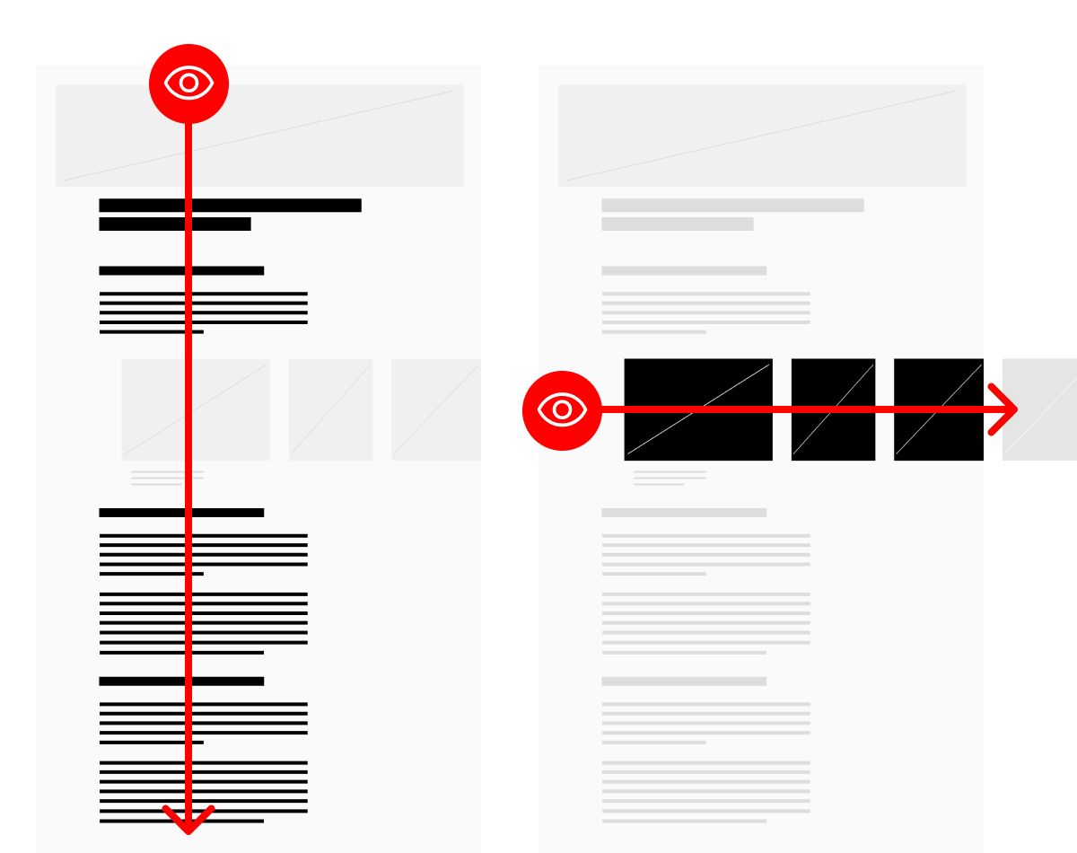
Scanning is vertical; immersion is horizontal.

There is a clear benefit to arranging information along a single axis. It helps people scan a screen more efficiently and accurately, maintain their focus for longer, and devote more of their attention as they process the information they see.
Mixing up the arrangement of information in a layout across multiple axes purely for aesthetic reasons is not a good idea. It just makes it harder for people to scan. But sometimes, interrupting the axis does makes sense.
Intentional Axis Interruption
One example is when the vertical axis is interrupted by non-essential but beneficial information that is distributed along the horizontal axis.
Imagine a case study, where the narrative is constructed along the vertical axis and made very easy to scan; a heading and short paragraph covering the challenge, the solution, and the results. What I observe most commonly in the case studies my clients create is that even when the narrative is arranged in this way, it’s difficult to scan because each section contains a wide variety of supporting imagery in many different — and often inconsistent — arrangements.
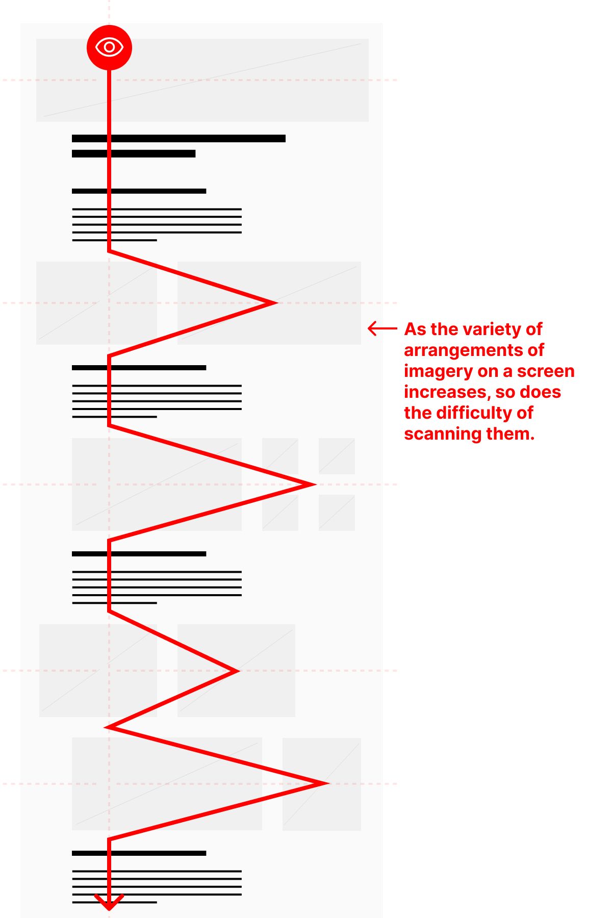
I typically recommend consolidating the imagery in a single module that expands across a different axis. This makes it easy for a person scanning the page to immediately understand its information architecture.
In seconds, they can not only understand the kind of information the screen contains, but they can understand how it is arranged (challenge, solution, results) and how the imagery plays a role in supporting each section.
The choice to explore the imagery in a more focused way, then, becomes exactly that: a choice. The conclusion they are intended to draw from the case study — does this provide the proof I need — should not rely upon prolonged immersion, though it should obviously benefit from it.
Remember, our screens must be designed communicate the most information as accurately as possible given the least amount of attention. If they do that, then they can support increased focus and prolonged attention. Whether that is in the form of deep reading or scrutinizing images, the scan has to happen first.
This is where axis interruption works well.
The Road Through Your Screen
Think of your screen as a road. Your audience is traveling on it — from the top to the bottom — quickly. There are attractions along side of the road, but at the speed they’re going, they need to be able to see them and understand what they are ahead of time in order to make the decision to turn off the main road and explore them. And, they need to be able to continue forward, understanding what they’re passing.
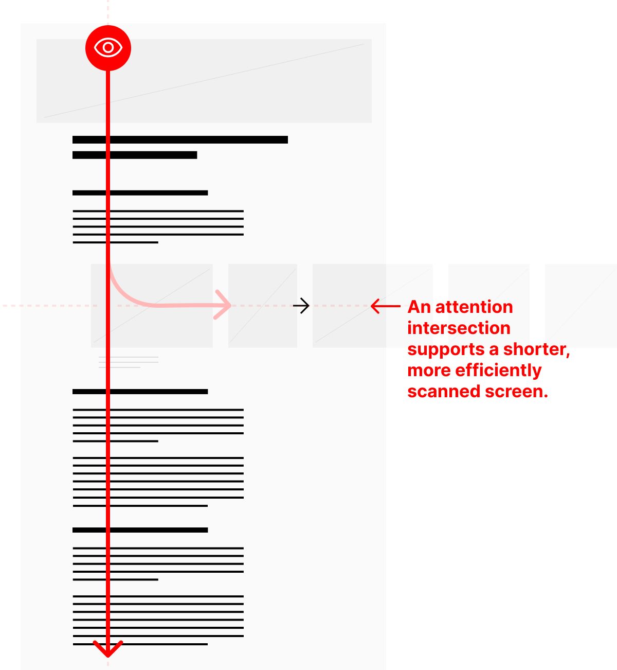
The screen’s axes become an attention intersection — vertical to continue on in the narrative, horizontal to turn off an explore something at a deeper level. Long screens can look impressive at first glance, but they experience significant attention attrition from top to bottom. We have to design around that reality.
This approach makes for a shorter, more efficiently scanned screen; it keeps map short and the territory wide. It lets scanning happen vertically, and immersion horizontally.
Christopher Butler, June 2, 2023
Filed under: Essays