Using the Y-Axis to Maintain Focus and Attention
Anchoring the most important information to the Y-axis will support better communication.

Attention is the Product of Focus
Attention is the product of focus. It is what we give information — our observation, concentration, and consideration — when we are able to maintain focus. That means that attention is not just a function of the mind; the body supports and sustains the mind’s ability to focus.
When we design a layout — whether as a page, a screen, or a scene — we have to think about how a body will interact with it, and whether we have arranged information in a way that makes it easy for a body to let a mind focus.
Here’s a brief example from a different kind of screen experience that demonstrates how the connection between the posture of a body and the focus of a mind creates attention.
As a child, I often wondered why the aspect ratio of a cinema screen is wider than it is high. The reason is simple: it’s what the body wants. There are many reasons for why specific aspect ratios have been chosen over the years, but the reason they are all in what we call a landscape orientation is because of how they correspond to nature. When you face forward toward a screen that is wider than it is tall, your peripheral vision allows you to see it completely. You can scan over its entire surface — up-and-down, left-and-right — without moving your head. If the screen were rotated 90 degrees, you would find yourself continually nodding your head up and down to capture all the information it contained. No one would like that. The screen, too, would be constrained. Every composition would be cramped — forced to reduce the action it contained or to shrink its contents down in order to fit them in their space. It just wouldn’t portray the world as we see it, and we wouldn’t be able see it especially well anyway.
The cinema screen’s aspect ratio is optimized for a human body that needs to see as much as it can while remaining still for an extended period of time.
Bodies focus; minds attend.
How We Look at Grids
Imagine a simple grid. The horizontal span — left to right — is the X-axis. The vertical span — up and down — is the Y-axis.
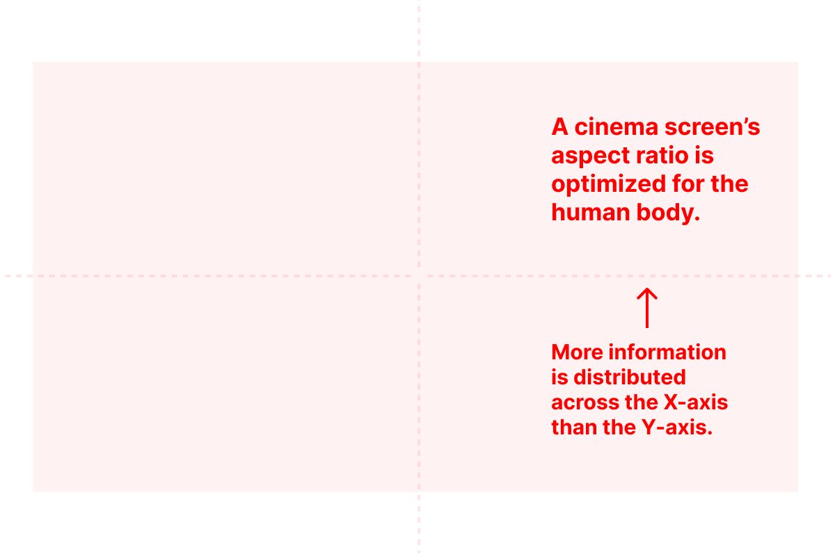
If you overlay this kind of grid on a cinema screen, you can see that the screen provides more space for information along the X-axis. We already understand why it does this to correspond with our bodies’ structure. But it’s also interesting when you consider how information on graphs is commonly arranged along their axes.
On most graphs, the independent variable is distributed along the X-axis, while the dependent variable is on the Y-axis. Again, there’s a body-mind connection here: displaying data this way makes it easier to track change while reading it left to right, as is the Western convention.
Now, imagine a graph showing how a child’s weekly allowance accumulates quarters in their piggy bank. Along the X-axis, they plot an entry every week. On the Y-axis, they plot the increasing value of the bank’s contents.
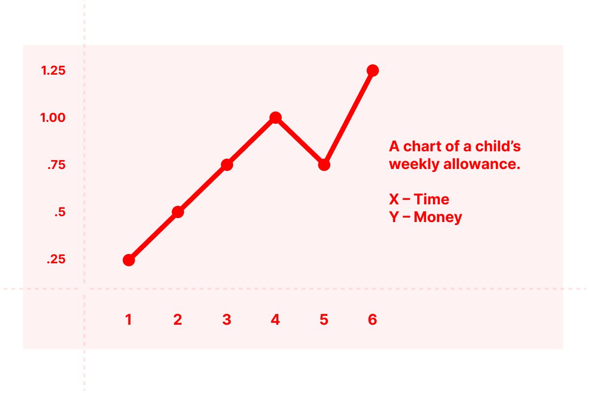
On Week 1, the child receives $0.25. By Week 4, they have accumulated $1.00. On this chart, time is the independent variable — it progresses objectively, or neutrally, relative to the change the graph has been created to show. The amount of money is the dependent variable. It could go up or down depending upon a variety of things.
Perhaps on Week 5, the child decides to spend $0.50 on candy. Their total then would drop to $0.75. Perhaps on Week 6, the child earns extra for helping with chores around the house.
I like that notion of independent and dependent variables because it works nicely when you think back to a body at rest. Looking up and down is dependent upon more movement of more of the body than is looking left and right. When your position to the thing you’re looking at is optimized, you can nearly forget your body entirely. It can feel as if your mind is working independently of your body. It isn’t, of course, but the illusion that it is comes from the body’s ability to focus the mind.
How We Look at Computer Screens
Looking at a computer screen shares some important characteristics with looking at a cinema screen. Computer screens tend to be wider than they are tall; again, aligning with the ways our eyes extend our vision peripherally. But there are two differences that are especially important to how we arrange information for computer screens.
The first difference is that we sit very close to computer screens. In some ways, that’s in proportion to their size. We can more comfortably sit farther away from a cinema screen because of how large it is; sitting too close would require more movement of our heads to see more than just a little bit of what it displays. Even a very large desktop display is just a small fraction of the size of a cinema screen. Still, at common viewing distances, our peripheral vision doesn’t enable us to see the contents at the edges of a computer’s screen as clearly as those at the center.
The second difference is that the contents of a computer screen tend to be arranged vertically. This is because computer screens are containers with fixed dimensions that let you look at information that often needs more space than the screen provides. The size of a web page, for example, might be 10x the vertical space of a computer’s screen. This is why we scroll through information.
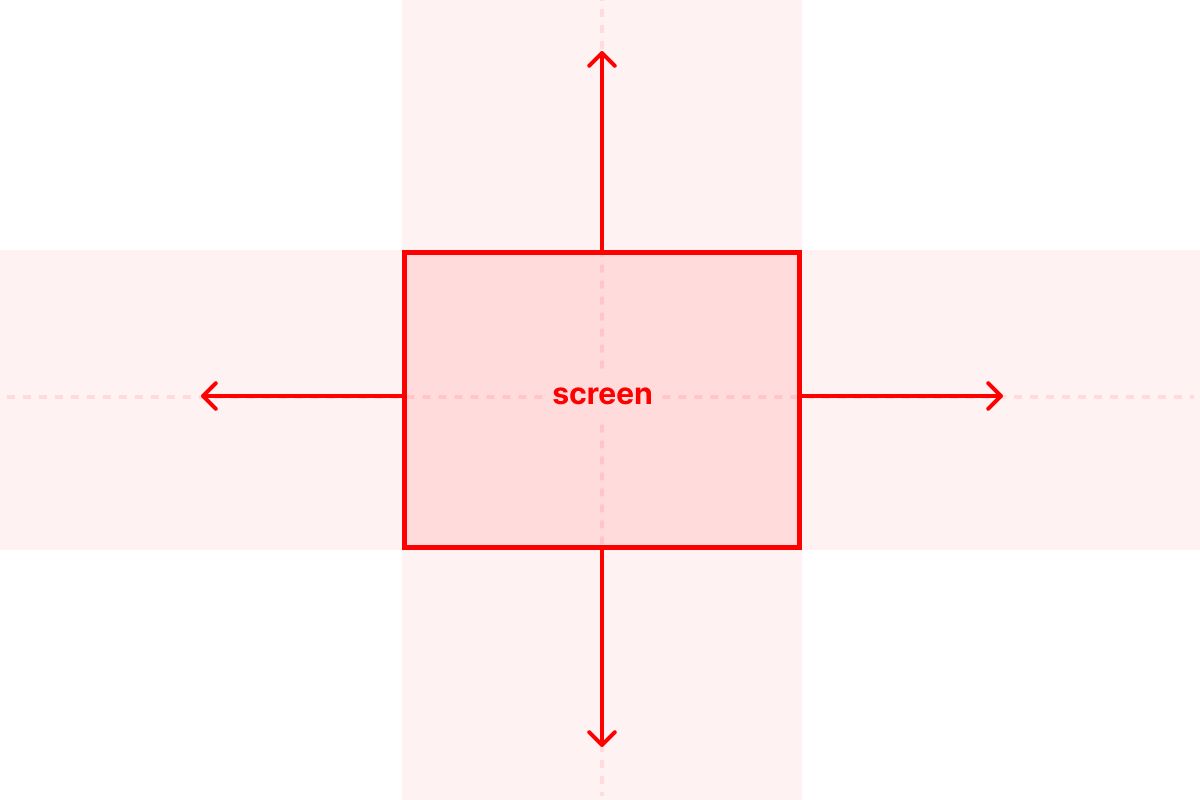
These two differences come together to heighten the importance of the Y-axis on a screen. Like on a graph, it is the axis on which dependent variables lie.
A long essay could be arranged on a screen like it is in a book, which left and right pages. This would allow for more text to fit on the screen, but it would also require movement of the reader’s head — more, in fact, as the size of the screen increases. Information arranged in a single column, on the other hand, will require more vertical space than the screen can provide. This is why the scrolling convention was invented for interacting with digital information. The axes can extend into infinity in either direction; scrolling “moves” the screen across them so that the body can remain still.
How to Arrange Information to Maintain an Attention Axis
When you’re arranging information for the screen, the Y-axis is your best friend.
Because we not only know that people will scroll, but that they are often scrolling before they even make sense of what is on the screen, helping them to maintain focused sight is critical. We can do that by thinking of the Y-axis as an attention axis.
Remember, because of scrolling, the contents of your screen are likely in motion while they are being scanned. Scanning is when a person assesses the nature of your information, determines its relevance to them, and then decides whether to give it their full attention. As the contents of a web page, for example, move when it is scrolled, a person’s focus is stronger when it is fixed on one axis. And that is entirely dependent upon your design.
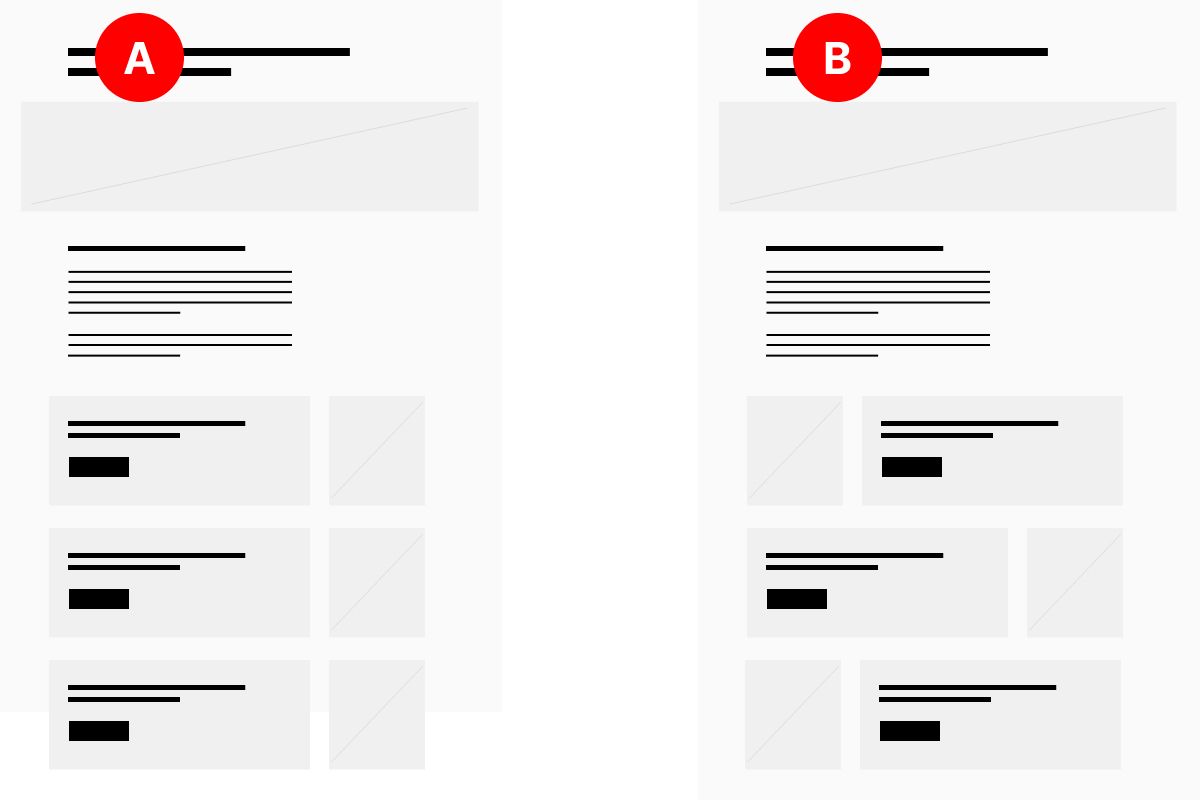
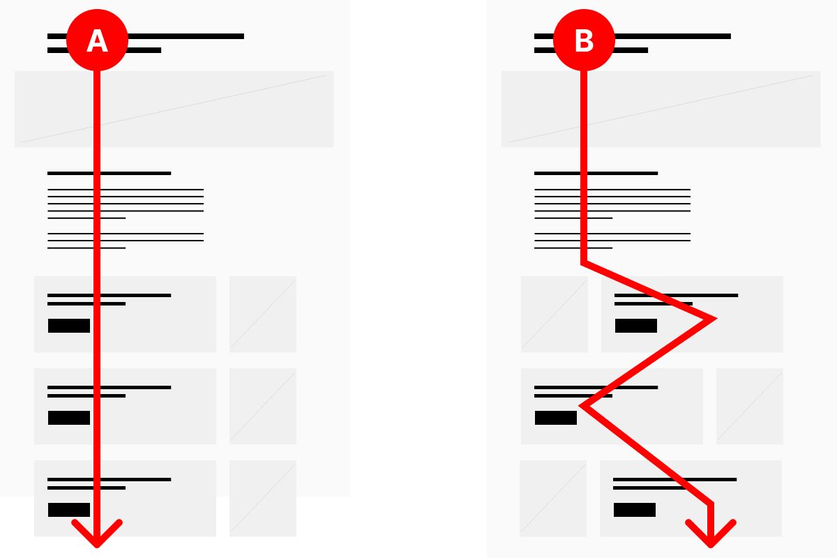
Which is the better layout, (A) or (B)? The answer depends, of course, on what we mean by “better.”
I have been witness to countless design reviews where the consensus opinion is that (B) is better because it’s more interesting, less repetitive, more creative, or more or less of some other subjective notion. None of those things matter as much as people tend to think they do.
Here’s why layout (A) is better: it establishes an attention axis. When you place every important element along one axis — in this case, the Y-axis — you’re enabling the viewer to maintain physical focus, which supports the mind’s ability to pay attention.
Layout (B) varies the alignment of elements in order to make the overall composition of the page look more interesting, but it forces the scanning pattern to move across two axes of attention, not one. Depending upon the size of the overall layout, the person might even need to move their head back and forth in order to track with the headlines they are trying to scan. And depending upon how powerful the images are in this layout, the possibility of maintaining a focus on the text might be even more difficult.
A layout — especially for a web page that has been created to be read — shouldn’t prioritize novelty over efficiency.
Looking -> Scanning -> Reading
Think of the first few seconds of a person’s experience looking at a screen as a process like this:
- looking
- scanning
- reading
Every time the continuity of an attention axis is broken, it restarts the process. A new visual element draws the eye (looking) and forces the mind to process what it is, understand its relationship to everything else, and make a judgement about its relevance (scanning). Then, a decision can be made — either to move on, or move in and focus so that attention can be given to reading or taking an action.
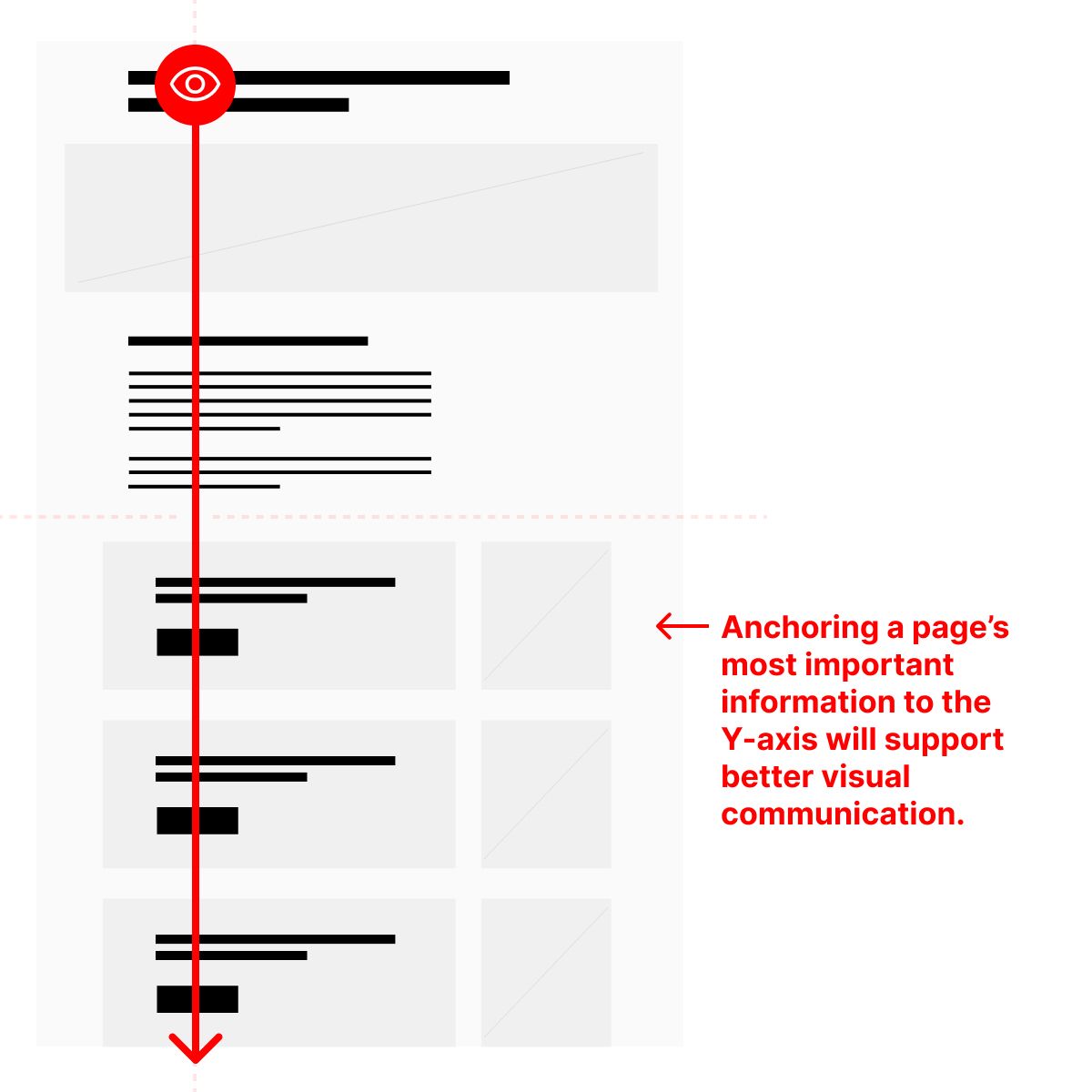
If you get one thing from this essay, it should be this: Anchoring the most important, scannable information to the Y-axis will support better communication. It allows a viewer to accelerate their scan without losing accuracy or restarting their visual orientation process.
We want our audience’s attention shifting to be controlled, not erratic. We want viewers to shift their attention from looking to scanning to reading, not from looking to scanning to looking again. The more we do that, the more we deplete a limited store of our viewers’ time and patience.
P.S.
It was not lost on me as I wrote this — truly, every time I used words like “see,” “eyes,” “body”, etc. — that this is an analysis that only holds for not only the sighted, but also those without chronic conditions or injuries that would make it impossible to not always feel their bodies, regardless of whether they are in motion or still.
I frequently found myself imagining the response of such a person — “That’s not my experience.” I hope I’m not read as being any more definitive about this experience than I have right to be. Of course this doesn’t describe every human’s experience.
The core point here is not really to generalize about how humans work, but to specify how information can be arranged to better suit those who are looking at it.
Christopher Butler, May 27, 2023
Filed under: Essays