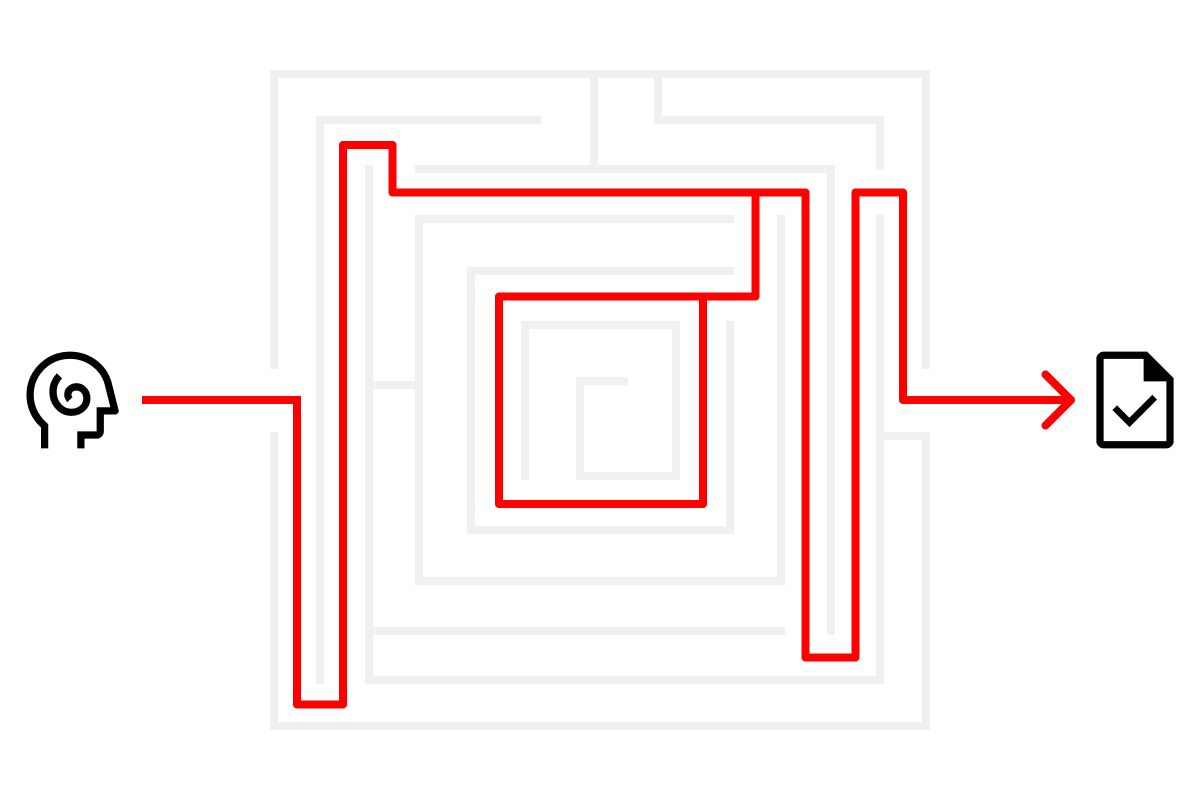
Creative is 10%. Structure and systems are the rest.
The discipline of design is the commitment to structuring and systematizing good ideas.
Ideas don’t stand on their own. When a good idea turns into a good thing, it’s because structure and systems — ones that existed before the idea — made it happen.
There’s this myth in creative spaces that systems are where good ideas go to die. That innovation almost always means breaking free of structure. This couldn’t be further from the truth. It’s a toxic framing that tells you everything you need to know about how designers misunderstand the role of novelty in their work. But more on that in a moment.
Structure and systems don’t squash creativity and make everything look the same. They don’t squeeze efficiency and profit out of beauty and craft. They can do those things. But that’s not what they’re actually for. Structure and systems are not just a designer’s most important tools — they are, ultimately, what design is. They are what make it possible for a new idea to be understood and experienced — to be made.
But they only work if they’re applied at the right times.
At this point in my career, I’ve worked with somewhere around ~120 individual designers and ~150 individual programmers, developers, and engineers. Every one of them had good ideas. Few of them were able to sustain those good ideas all the way through the launch of what they were hired to make. After twenty years of observing this and helping people work through it, I think I’ve come to understand the root causes. There are two you need to understand.
The first thing that blocks good ideas from becoming good things is that most designers misunderstand the balance of ideas, structure, and systems in their work — how the value of each aligns with the time and attention given to them. The second thing is not integrating structure and systems at the right times. And there you go — the very notion of doing the right things and the right times is a systematized structure.
There is no idea that exists independent of structure — no thing, no experience, no corner of reality that isn’t a structured part of a really, really big system.
More Can Come From Less Much Easier Than Less Can Come From More
The portion of value, work, and time applied to generating an idea is almost always overestimated by the designers with whom I have worked. They’ll spend days (sometimes weeks!) generating a wide array of possible directions and in the end, perhaps one or two is worth pursuing. Now, this may be necessary — after all, I do believe that the way to make good things is to make many things. (It’s presumptuous to assume that the first thing we make is the best.) However, what I have observed time and again is that once that first burst of creative activity subsides and a direction is taken, further burst of similarly unfocused creative generation follow.
When this happens, I’ll find myself in reviews of initial layouts or compositions asking why there are so many new ideas present — so many different visual elements, so many different facets to a visual language, or so many different types of images — and urging designers to reduce them back to the one or two that are strong enough to carry an entire visual system.
The more idea-dense a visual language is, the more difficult it is to systematize and understand. It’s too easy to boil this down to the well-known adage, “Less is more”; it’s absolutely the right idea, but I often add that “more can come from less much easier than less can come from more.” This is an important, nuanced difference because of how important the systematization of an idea is.
Designers who understand it get praised for the elegance of their work; designers who don’t need an editor.
The Idea to Structure Ratio
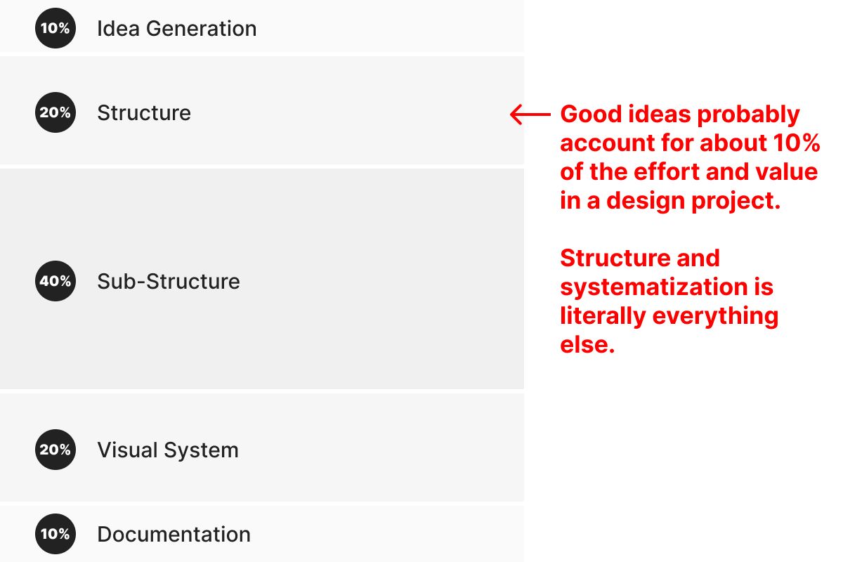
Idea Generation — 10%
Good ideas probably account for about 10% of the effort in a design project. That’s right. Just ten percent.
In an interaction design project, the initial design direction is typically expressed in an element collage. This is a presentation of the elements of a coherent visual language that is intentionally deconstructed. The idea is to show how those elements — colors, shapes, typography, imagery, etc. — can work together in a variety of different ways and secure your constituents’ comfort with the visual language without asking them to approve specific layouts. It shouldn’t be overly labored, and should reflect a balance of exploration and limitations. Coherence is the key here — it should all feel like it’s part of the same world without being so specific as to signify specific landmarks.
Structure — 20%
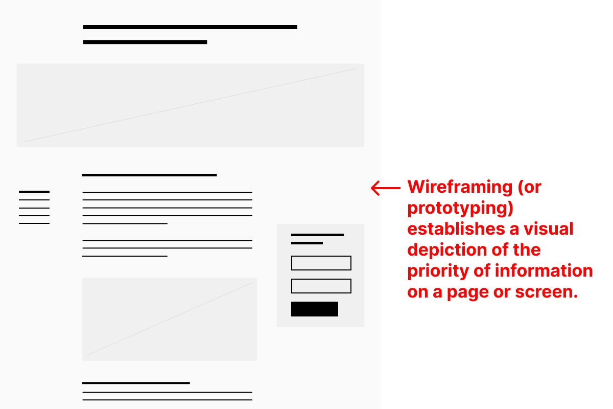
Creating a structure to support them — creating the pages, screens, or scenes that provide a consistent landscape for attention and use — is about 20%. This is where we systematize the outward-facing information architecture of our thing. In interaction design, we tend to call it prototyping or wire framing. We’re committing to a structure here, but not to how that structure looks.
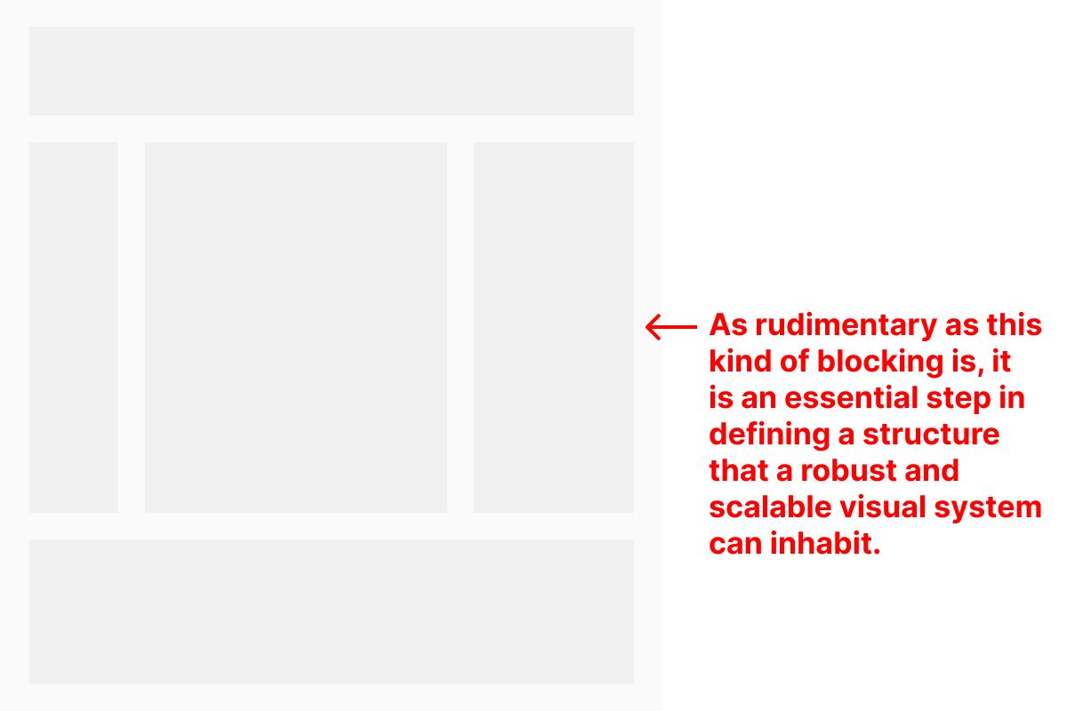
I have begun this part of the process the exact same way for the entirety of my twenty-year career. The tools have changed; the point has not. Before I create a prototype, I make sure that the intended experience makes sense. I have to consider who is intended to use this thing and ho I expect that to play out in terms of information and actions. In an interaction design project, I will always pre-prototype with extremely general screens. I call this “blocking” because, well, I use blocks. Big ones. They should start to divide the landscape of my screens enough to start to distribute information and interaction points without committing to shapes or edges of things.
Once my blocking makes sense, I start filling the larger areas in with just enough detail to demonstrate the information architecture of the space as well as visually indicate the priority of information and possible actions. While I have found that establishing a column-based grid is useful for developers starting with existing markup frameworks, there’s little point in using them if your elements don’t follow any other rules.
Sub-Structure — 40%
Integrating the sub-structure in design — considering taxonomies of information, connections between elements (both functional and conceptual), and the admin layer of user experience — is actually 40%. This is a step that is often completely forgotten or misunderstood by designers. When designing a website, for example, it’s the stage when a designer considers what is modular and what is not, how content types are structured in a database, how information is integrated with existing internal and external systems, and how the content management system will be used by others to maintain what they have created. This is the comprehensive systematization of a thing. It’s the largest portion of effort and value because of how detailed it is, how much collaboration it requires, and how much it impacts the strength, scalability, and overall elegance of the final product.
In an interaction design project, this is where designed components become system modules. A good thing to remember here is that just because you made it a component in Figma doesn’t mean it makes sense for a developer to treat it in the same way — say, as a system component, content type, module or, in the parlance of Wordpress, a Gutenberg Block. Creating components in design tools enables easy updating within the design process; it shouldn’t necessarily make demands upon further implementation.
It’s also essential here for a designer to continually differentiate between elements in a design that are fixed (i.e. “hard coded”) and are fluid (i.e. managed content). Noting this as a step in final documentation isn’t enough. It must be fully thought through early on in order to fully account for how fluid design elements will alter the shape, size, and experience of other elements, fixed or not.
Visual System — 20%
Creating the final visual system — the complete visual language and pattern library that is the result of joining the initial idea to the outer and inner structures — is the next 20%. The more complete the systems are — those wireframes, prototypes, taxonomies, and content plans — the more quickly and naturally the visual language will come together. I’ve observed that when designers spend more time refining unstyled systems, they spend less time trying out a variety of visual elements, like typography, shapes, colors, image treatments, and combined elements (e.g. cards) or interaction details. Most designers call the product of this “high fidelity” designs.
This is the stage where, if the previous two aren’t handled well, I start to see a lot of unnecessary new creation that distracts from progress being made or obstructs a system from cohering or remaining together.
Again, my personal process for this hasn’t changed in twenty years. Before I begin laying anything out, I go back to my blocks. Not the second stage wireframes, but the previous, simple blocks. I use them as my starting point so that I don’t overcomplicate the structure of a screen by making choices solely based upon how interesting I find the graphical relationship between various elements to be. Without those general boundaries — and then using the more detailed wireframes as guides — the seduction of text, color, shape, and image is profound. Inconsistencies in structure and visual language are almost always the result of not starting with and maintaining a commitment to the underlying structure and instead over customizing layouts to make them prettier and more novel.
When you review screens or templates and notice that things like headlines or lists or cards are treated differently on nearly every one for no obvious reason, this is usually why.
Documentation — 10%
Finally, the documentation of the visual system is the last 10%. The documentation needed for implementation and maintenance of a thing is increasingly extensive. But the effort to create that documentation should be relatively minimal if structure and systems are properly leveraged beforehand. When you do that, you’re basically documenting as you go.
If you find yourself spending a large amount of time “cleaning up” your composition files and weeding out from them lots of material that didn’t “make it” through the process, that is probably the result of extending the idea generation work too far and not putting enough emphasis on structure. Similarly, if you find yourself revising your composition files and adding use-state detail to them at this stage because it’s the first time you’ve gotten feedback from someone else, then that is probably the result of having underserved (if not entirely omitted) the sub-structure work.
Systematize at every step!
If you get one thing from this entire essay, I hope it is that systematization is the rigor of design.
No designer, no matter how creative or famous, has the luxury of settling for chaos. And on a much more philosophical level, no idea exists without itself being an element of a superstructure of ideas that existed before it. Which means that no idea becomes part of the fabric of experience without being woven in. Ignoring the existing structure of fabric leads to snags and holes. That’s bad design.
P.S. “You don’t find anything out until you start showing it to people.”
David Kelly — of IDEO — said that. Getting feedback is something that should happen as frequently as possible, not just at the end stage of design work. I haven’t included it as a separate element in my breakdown above because it is — at least, in my opinion — far less quantifiable as an element of design work. Feedback could come from a peer, from a director in a review, from a client, from a user, or even from yourself if you get enough distance. I felt the need to mention this as it probably appears like a glaring omission from this particular structure and system.
Structured feedback takes form in a quality assurance (QA) system. Good QA happens at key stages of a project, determined specifically by the kind of thing that is made and the kinds of technology used to make it. The best QA has an intentional distance from the creative process - it has to be isolated and insulated in order to best see and expose flaws. I’ve worked with a very few excellent QA specialists in my career, and what they’ve all had in common was the ability to follow a rigorous and excruciatingly detailed and structured system over and over again. I’ve never met a designer who can do that for themselves.
Talking about QA would be the easiest way to make the point that good ideas live or die by structure. But since a designer can never fully assure the experienced quality of their own work, it’s more important that they learn to use structure and systems aligned with their craft in order to get as close as possible.
Christopher Butler, May 13, 2023
Filed under: Essays