4 Levels of Grids for Web Designers
Grids are very, very useful.
I just published an essay on how anchoring the most important information on a web page to the Y-axis will help viewer’s focus on it and pay closer attention. It’s a pretty basic idea, really, but somehow I found myself writing over 1,000 words to describe it. I won’t do that here.
Instead, I want to provide some very brief direction on using grids. Grids are a fundamental component of any design practice, and especially so when designing things for screens.
There are (at least) four levels of grid use in interaction design:
- Alignment
Aligning two or more objects to one another creates a grid of their negative space. So even if you don’t begin with a grid you can see, adjusting where objects are so that they share a boundary will begin to suggest a grid beneath them.
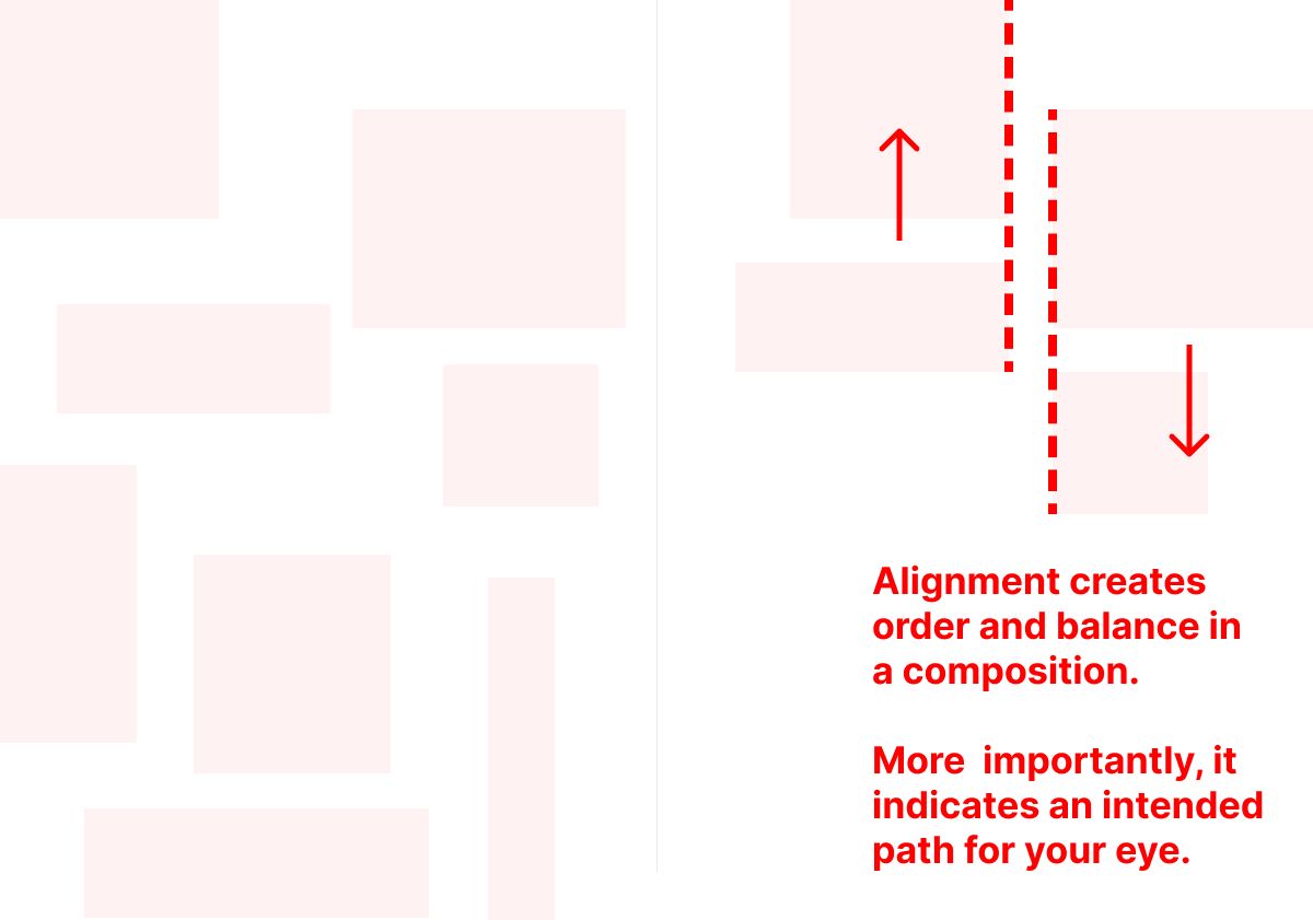
Alignment, of course, is important because it creates order and balance in a composition. But more important to interaction design is how alignment assists a viewer in understanding the relationship between elements and their priority.
Aligned objects provide a path for the eye.
- Spaces
A common tendency among designers is to start with few to no layout commitments. We’ll quickly place elements in a space, from which a layout emerges. But when a web page is one of many, the placement of a single element begins to create a system — or, it doesn’t. Both are a problem if we don’t stop to abstract our initial layout decisions in order to test them for consistency, clarity, utility, and simplicity in all the contexts they will display.
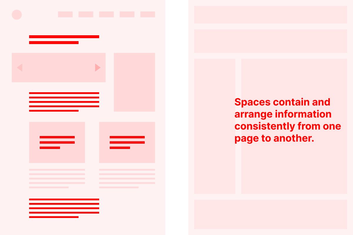
Laying out page types in terms of larger content areas — or spaces — in which information will be consistently displayed and arranged site-wide is a critical step toward systematization.
- Columns
Once you’ve established your core structures — page types, templates, or modules — another type of grid layer can ensure good proportions among elements, especially as viewport sizes shift.
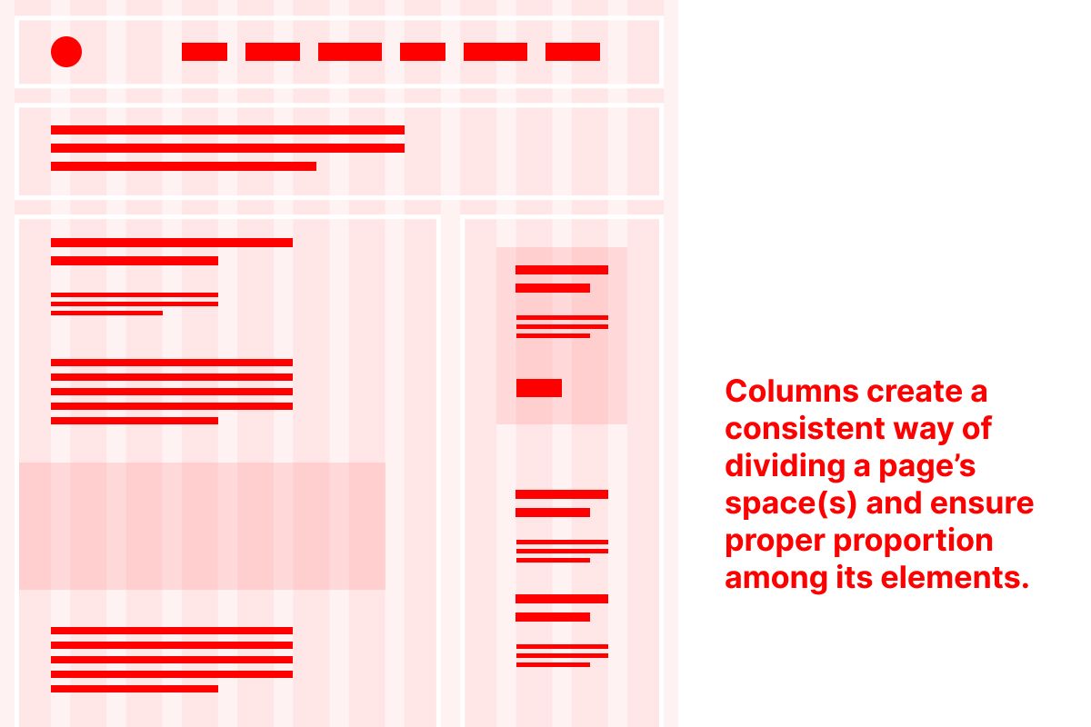
A multi-column grid — commonly composed of 12 equally-spaced columns — makes it very simple to divide your viewport size into equal portions as its overall size changes. That way, the proportions and spacing between your elements will remain consistent in as many conditions as possible.
- Vertical Spacing
Lastly, vertical spacing between elements is an important, though fussy step in precision design.
Plenty of tools allow for the automation of spacing among elements — Figma’s auto layout is a good example of this — and that can be quite useful, especially when systematizing things like buttons and button labels, for example.
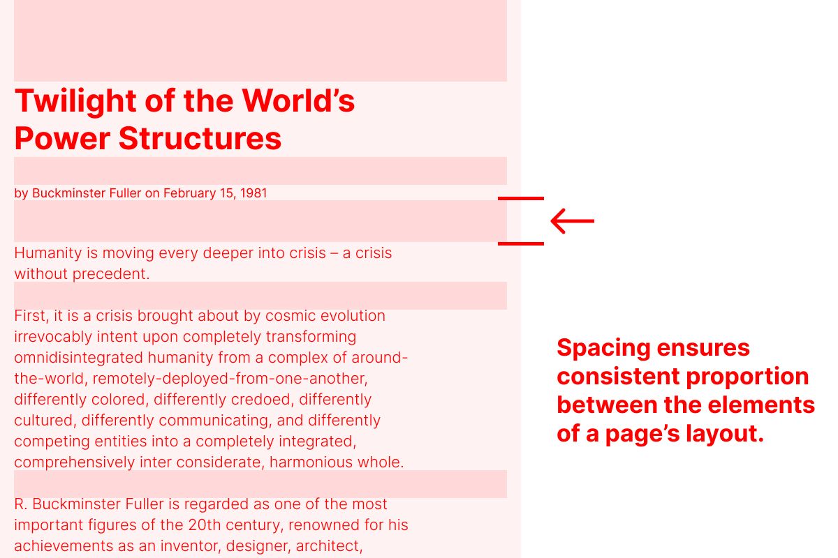
But I have found that specifying spacing between elements, like text styles in a style guide, or form components, can help to retain better proportions of space. For example, a headline style at one type size might need more space between it and the start of a paragraph than a sub-headline at a smaller size. As a type system gets more robust, these unique conditions can compound. Documenting them with spacing guides, which are essentially a vertical grid, ensures a consistent design (and a happy developer).
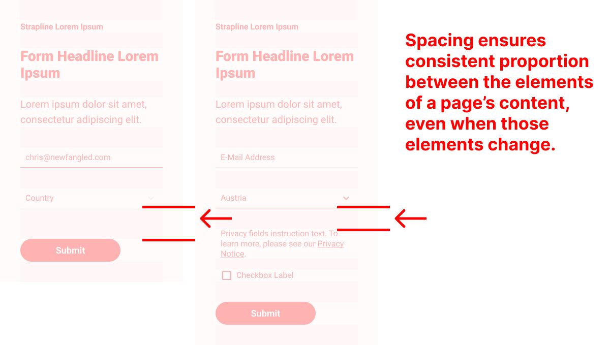
When an element’s composition changes in response to use, spacing might need to be adjusted. This is another good use case for manually specifying vertical spacing.
At Least Four Levels
Surely there are more “levels” of grid use — these are just the four that I thought of first. Even now, in 2023, I find myself reviewing these concepts again and again with the designers I employ and consult.
From the most basic — like alignment — to the more craft-intense and detailed — like vertical spacing — each “grid technique” relies upon the way structure brings stability, clarity, and consistency to layout.
Christopher Butler, May 28, 2023
Filed under: Essays